Overview
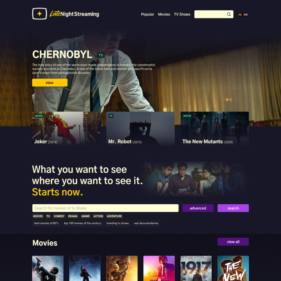
Currently the number of streaming services is enormous and it is not possible to see all the possibilities in one place. With this situation arises the need to have a site where to find all the information about movies and series and where to watch, rent or buy them. This is how LateNightStreaming was born.
Type
Brand Design
Product Design
Contribution
Brand Designer
Product Designer
Design Strategist
Platform
Desktop / Mobile Web
Team
Ignacio Toledo – Front
Task
Brand Design
Conceptualization
Benchmarking
UX Research
Wireframes
UI Design (Design System, High design and Prototyping)
Follow up with devs

The challenge
The proposal was clear. Create a product that would take the information and ranking of series and movies and provide availability on the largest number of streaming services.
It seems easy but it had its challenges. On the one hand, there is little competition but what there is is very good. The target audience would be very varied, since Eastern Europe was targeted. And finally, after research, it is decided to go for dark mode.

Immersion, research and brand
I had some first meetings with the stakeholders and development team to establish the brief. Then I carried out an exhaustive benchmark and analysis of streaming platforms and similar services.
From this, the creation of the brand concept, style guides and definition of the type of communication began. This would be the basis for the creation of the subsequent Design System.
My tasks
- Interviews with stakeholders
- Benchmark and peer analysis
- Concept and brand design

Design and follow-up
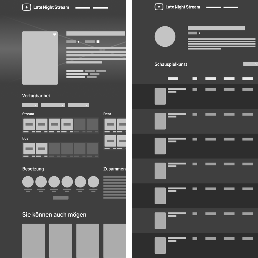
With the brand developed, we move on to creating flows and wireframes, understanding the scope, functionalities and accounting for the subsequent work together with the development team.
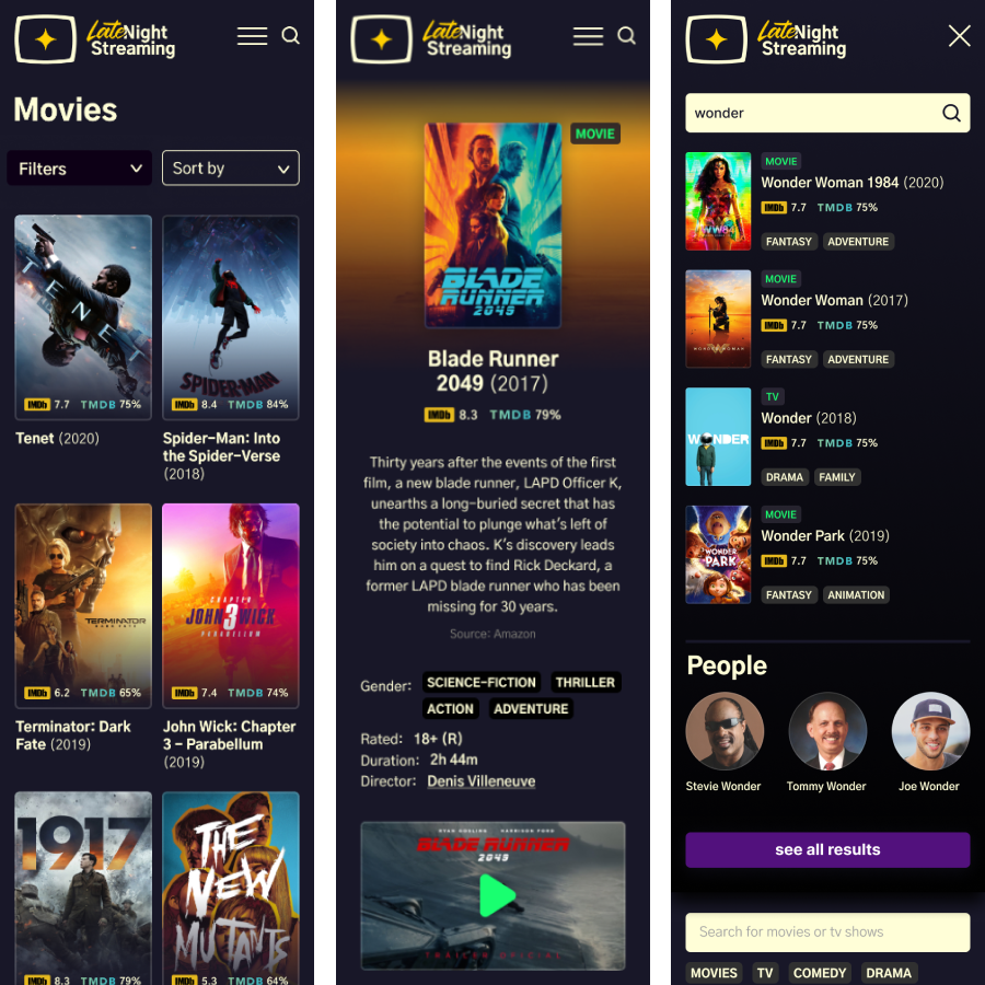
The management of colors, both gray and others, was taken into account for the design of the interfaces, in order to have good contrasts and good readability.
Another aspect we worked on was information loading times. Decisions were made about skeletons, placeholders in case of loading problems and feedback from the system so that the user knows what is happening.
My tasks
- Wireframes
- Analysis of references and aesthetic codes
- Design System
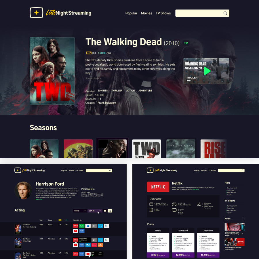
- Interface design
- Prototyping
- Development monitoring

Results
It was a job that lasted several months but with a solid, competitive product that managed to meet what was requested. An attractive site, dark mode, with a brand that accompanies the spirit.
Entertainment, and especially series and movies, is something light, something without complexities and this site shows it that way. But it provides the user with an immense amount of data and services that helps them make decisions to have a good time.
You can check the online version 😉