Overview
Remote education has grown a lot in recent years and has intensified in the pandemic with mobility restrictions. To this is added the large number of learning offers, from universities, institutes and private online course services. And finally, the value of the certifications in the different professions. In this context, the need arises to have a place where you can find a wide variety of courses from the different services and all in the same place, organized and easy to find.
Type
Brand Design
Product Design
Contribution
Brand Designer
Product Designer
Design Strategist
Platform
Desktop / Mobile Web
Team
Ignacio Toledo – Front
Task
Brand Design
Conceptualization
Benchmarking
UX Research
Wireframes
UI Design (Design System, High design and Prototyping)
Follow up with devs
The challenge
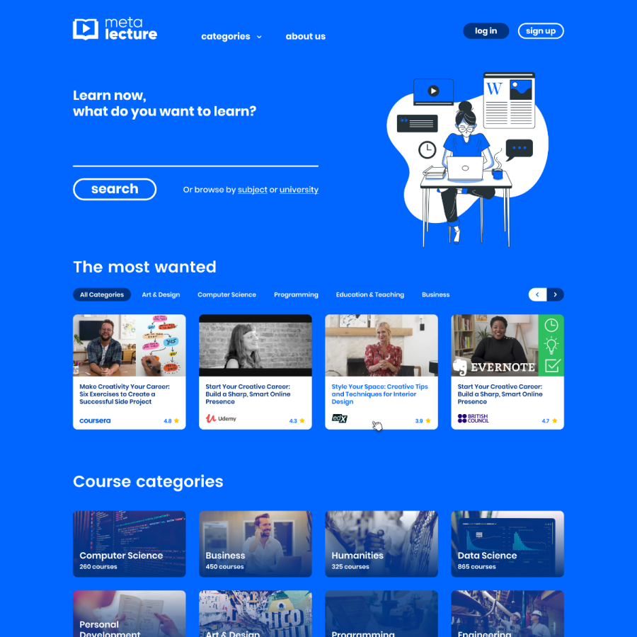
The supply and demand of work, such as the ease of remote access, make constant professional growth necessary. This causes a wide number of offers. In this context, trust in educational platforms is the most important thing and that was the case. The challenge of this project was to give the user confidence, quality and security in choosing their learning. The design of the data, the tone of communication, the association with the different universities and platforms are at the center of the proposal.
Immersion and Research
We begin with interviews with stakeholders, understanding the needs and scope of the project. Then I carried out extensive research on similar platforms as well as discussing technical limitations with the teams and with the sales team about alliances with third parties.
Then I developed a brand that talked about online education, taking advantage of the pandemic situation and recognized signs. A moodboard and a keyvisual of the brand were proposed that would lead to the UXUI design stage.
My tasks
- Interviews with stakeholders
- Benchmark and peer analysis
- Concept and brand design

Design and follow-up
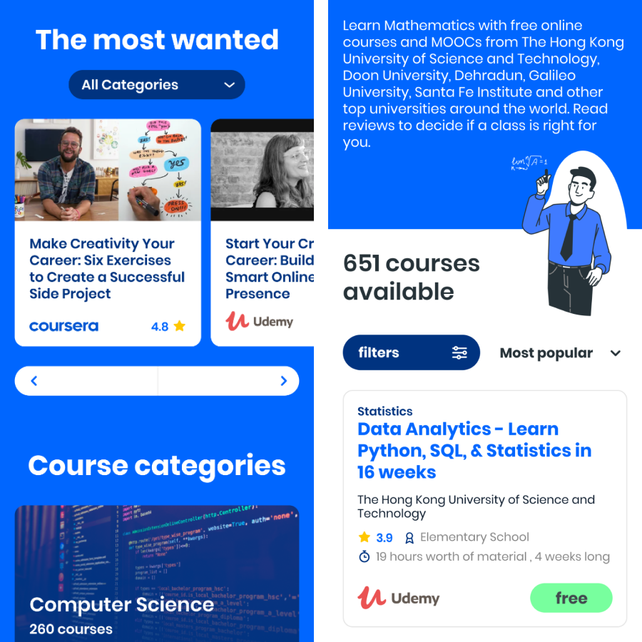
With the scope clear and a validated brand, I began to establish, together with the other teams, the functionalities and information architecture to move to the wireframes and validate them with the stakeholders. Once approved and with brand guidelines, I started with the design of the components and design system, sketches in Bajam, iterations, adjustments, high design, prototyping.
Once the designs, for both mobile and desktop, were finalized and validated, it was passed to the development team. From this stage, UXUI validation instances were planned in order to follow up until reaching the production version.
My tasks
- Wireframes
- Analysis of references and aesthetic codes
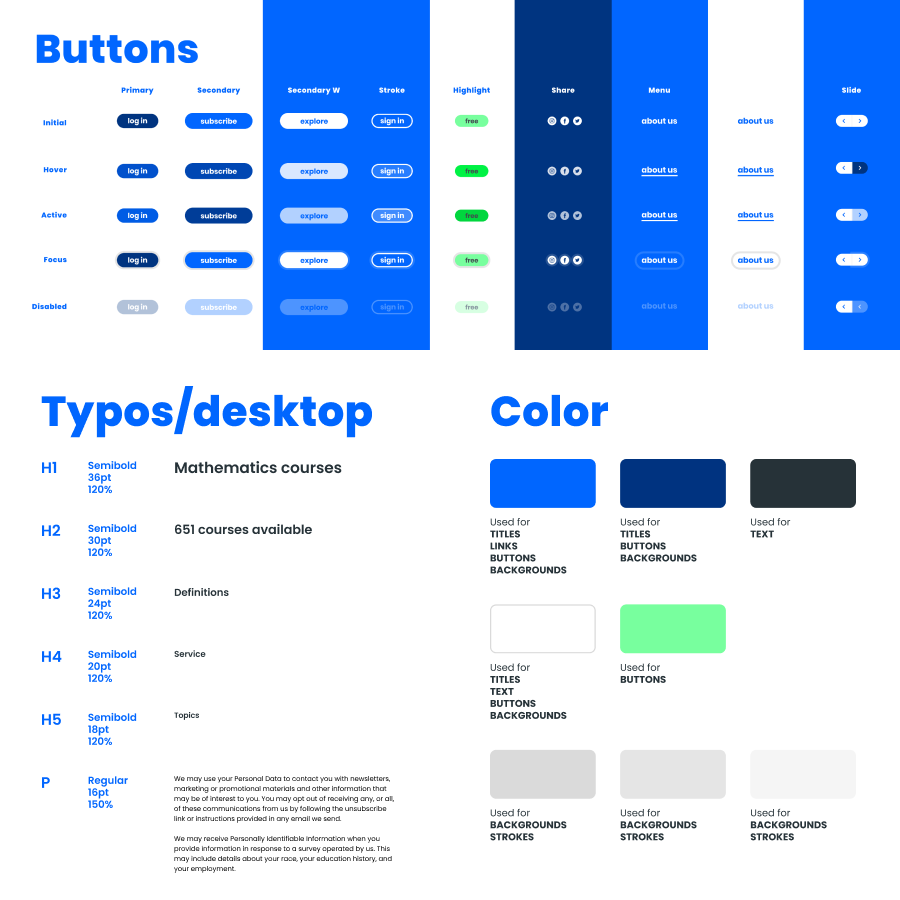
- Design System
- Interface design
- Prototyping
- Development monitoring
Results
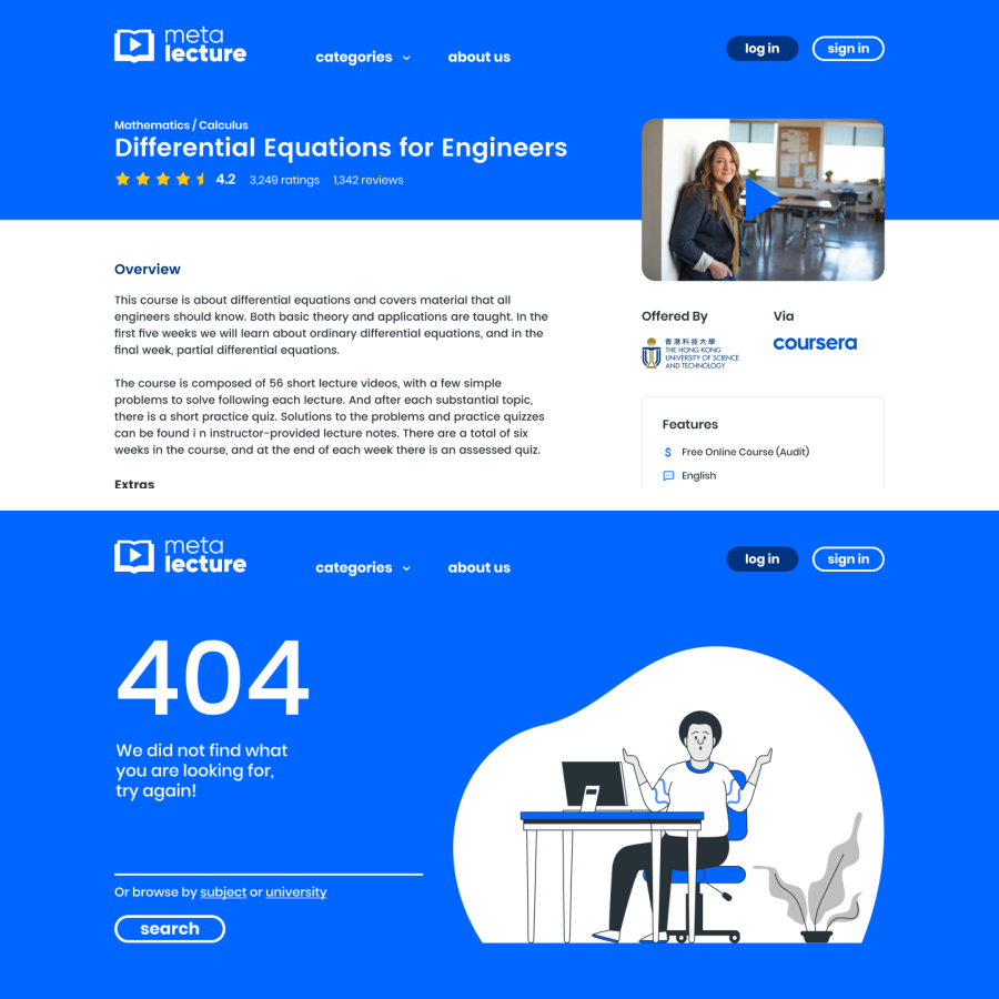
After a few months, a site is delivered with a friendly image and tone of communication, which invites learning, safe and trustworthy, both in the experience and in the educational partners. A simple and clear platform was proposed, young but formal, with everything necessary to access a wide variety of educational options.
Metalecture is committed to transparency, incorporating rating data and generating a community to share experiences about courses that provide information to be able to make a safe choice appropriate to the user’s needs.