UX
Case Study
Overview
For this project, the analysis and proposed solution for the payment process in the physical store of the Kinko chain in Uruguay were proposed.
As a UX designer, I carried out general research, audience analysis, purchasing process, vision statement, short-term (MVP) and long-term solutions, scenarios, MVP proposal, user flow, wireframes and next steps and efforts.
Type
UX Designer
My roles
UX Strategy
UX Designer
Deliverable
Research and analysis documentation
Solutions and planning
Task
Investigation
Analysis
Envision near term and long term solutions
Solution design
Planning
Design process
The process used for this process is divided into 5 stages: learning (observe), analysis (assess), direction (envision near term & long term solutions), design (define the bases to visualize an MVP) and planning (next steps and efforts ). This responds to the type and scope of the case, and can share stages with Design Thinking, Double Diamond, User-Centered Design (UCD) and Lean UX.

Challenges
What and how are the payment processes in stores?
How is the user experience?
How to improve the payment experience in stores in Uruguay?
Learning
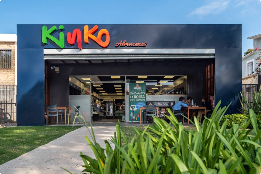
About Kinko
Kinko is a network of retail markets with more than thirty stores located throughout Uruguay. In these establishments, users will be able to find all the products they need to satisfy their needs as and when they need them, through a quality service, in a modern, warm environment and with extended opening hours.
Context
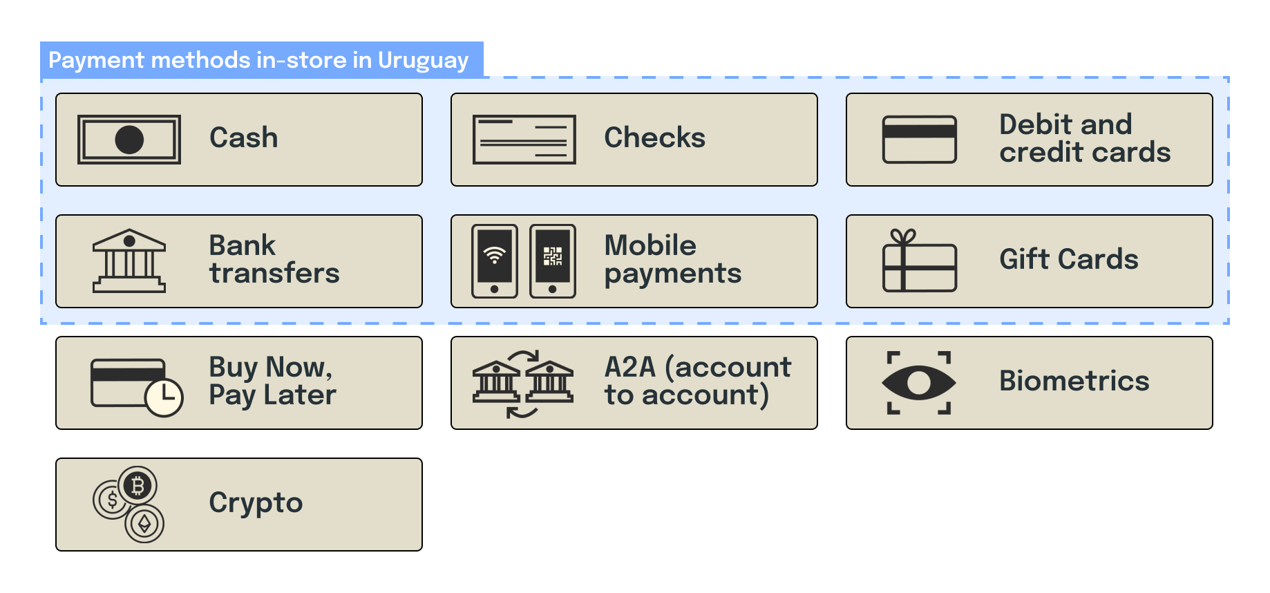
Payment methods in-store
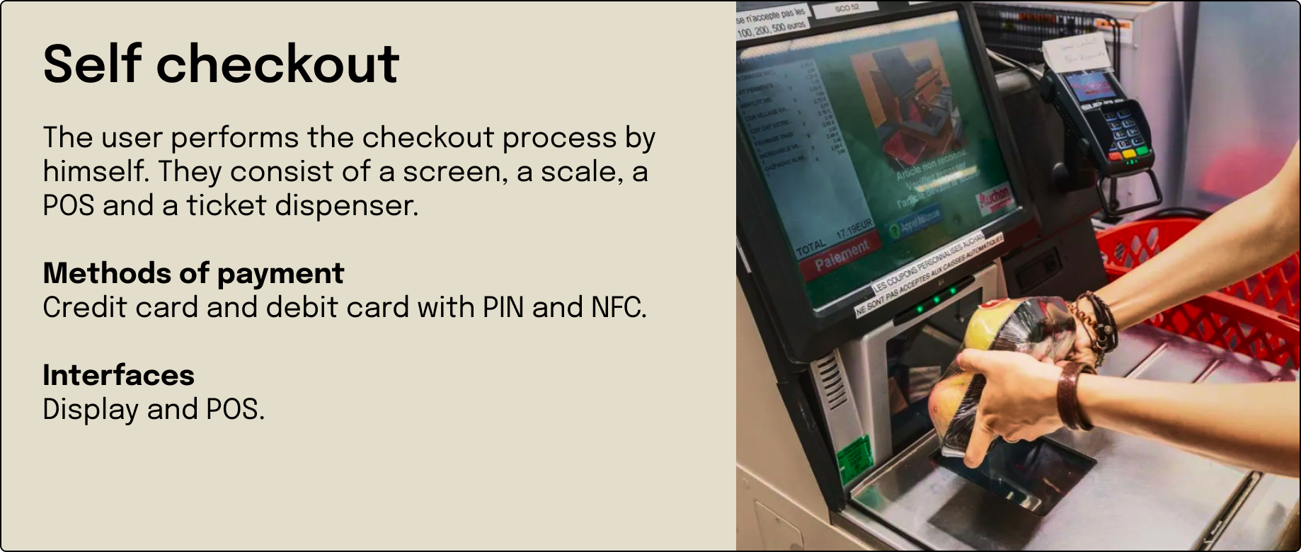
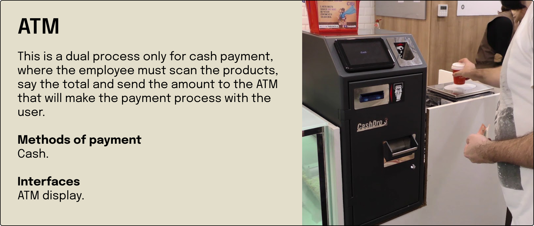
The first thing we did was understand the context. He investigated the payment methods, existing and those used in Uruguay. A search was carried out for studies and documentation on purchasing experiences, trends and innovations. Then we proceeded to detail the payment processes in Uruguay, the forms and the experiences.
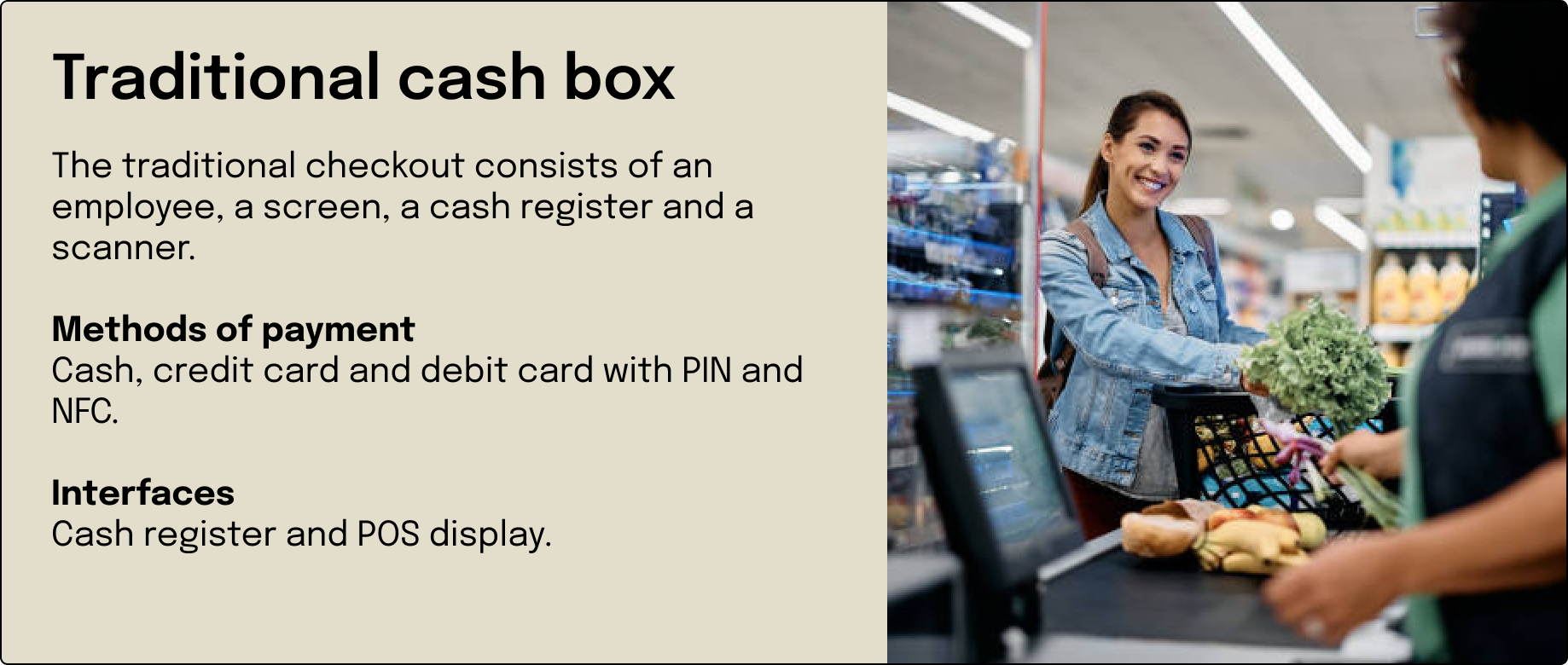
Payment process in-store in Uruguay
Interesting facts about payments
- The best payment experience is invisible..
- Contactless is no longer a luxury but a necessity.
- The adoption rate of mobile payments has increased from 10% in 2021 to 19% in 2022 (Europe).
- Self-checkout that reduces processing time by more than 30%.
- The in-store customer is increasingly demanding the flexibility of the payment methods.
- According to the World Health Organization (WHO), around 15% of the world’s adults have some type of disability.
- Approximately 95% of people with disabilities always have difficulties when making their purchases in the store.
- Biometric payment has emerged as an alternative to improve accessibility in payment systems.
Interesting facts about payments in Uruguay
- In Uruguay, more than 45,000 businesses will use the QR code as a means of payment in 2023.
- 48% of Uruguayans said they have used contactless at least once, while 25% use it regularly.
- In 2022, 20% of transactions were made with cash payment.
- 57% abandoned the use of cash and replaced it with debit cards and transfers.
- 60% of users make more purchases through electronic commerce than in person.
Users of convenience stores
Neighbors: People who live in the neighborhood form an important part of the convenience store audience. Many people use these stores for quick, urgent purchases instead of making more extensive purchases in supermarkets.
Workers and professionals: Convenience stores often attract people who work or study nearby and are looking for quick options for their daily needs, such as food, drinks, and convenience items.
Students: Since many stores are located near universities and study centers, students are a common audience. They usually buy snacks and drinks.
Tourists and pedestrians: Those people who are in transit, whether traveling or simply moving around the city, often turn to stores to satisfy their urgent needs.
Night Owls: Due to the extended hours of many convenience stores, those who work night shifts or have nocturnal habits are also regular customers.
Analysis
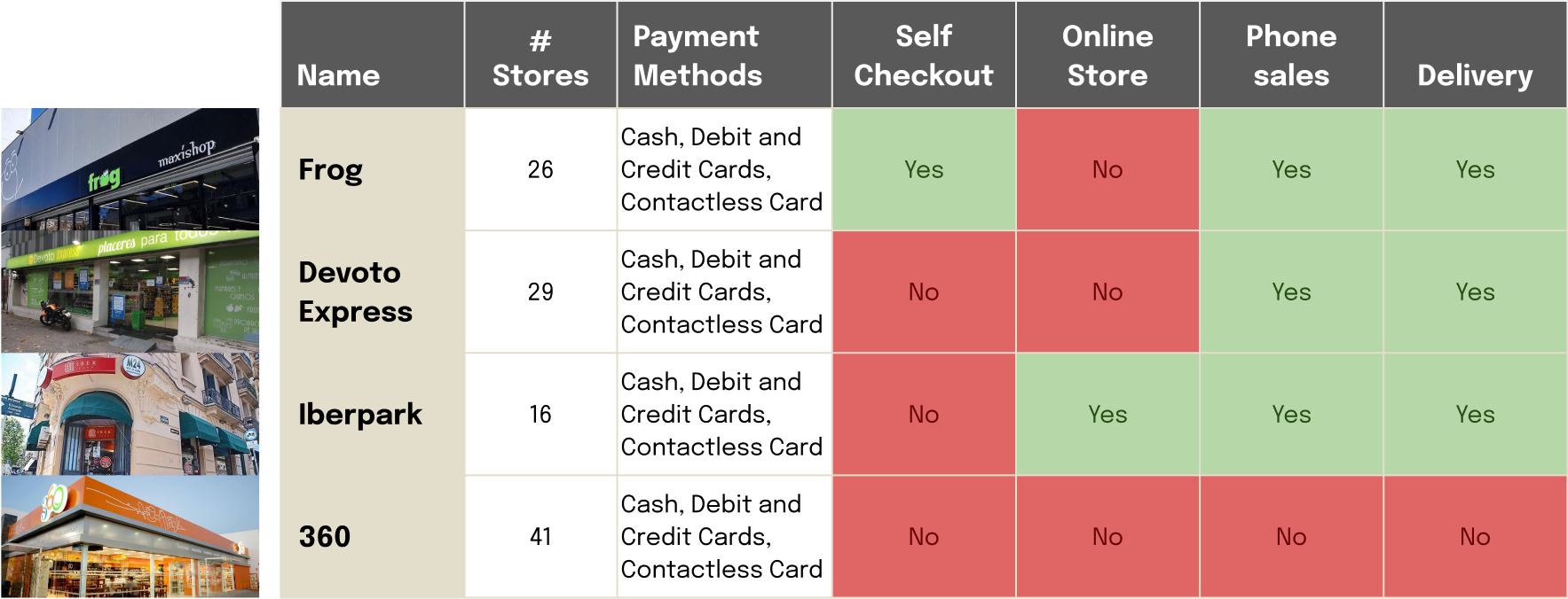
Competitor analysis
From the initial research, we proceeded to analyze the competencies, understand the different purchasing processes, methods and service offers. This gives us information about the context, understand the pain points and find the differentials between companies.
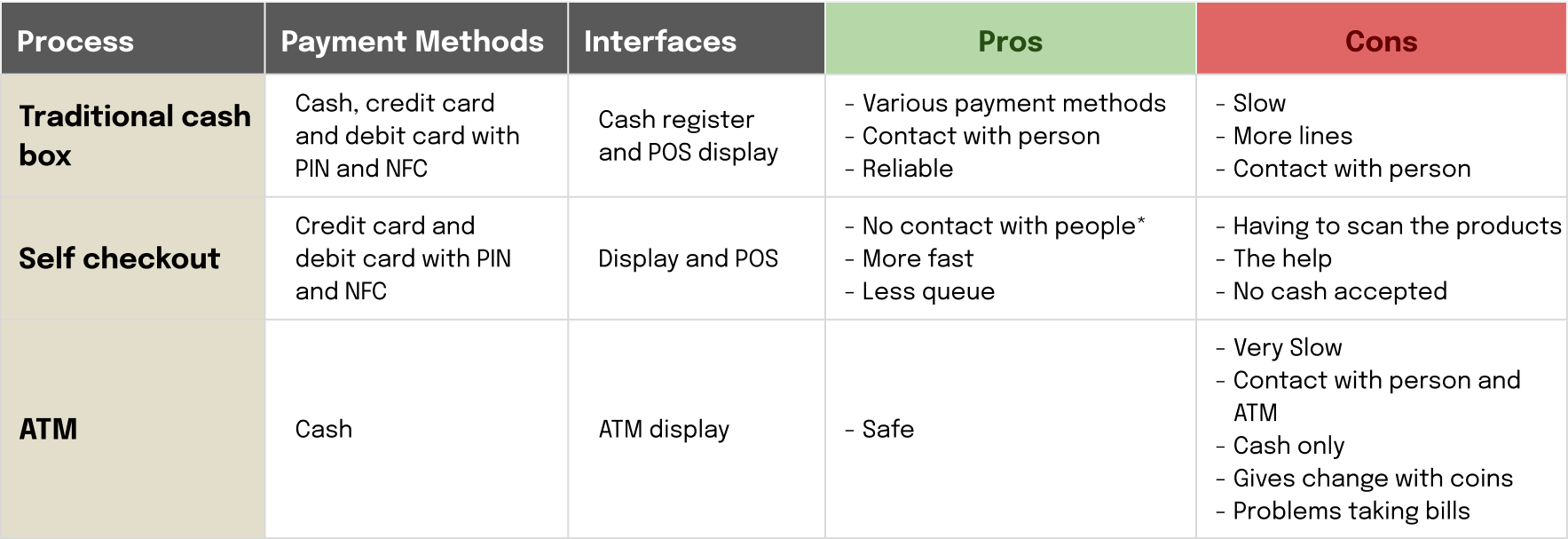
Analysis of the payment process in Uruguay
With the purchasing processes established, we proceeded to analyze the pros and cons and carry out the compared task flow. This graph allows us to understand how each character, systems and actions participate, providing information to cross-reference with user comments and trends.

User persona
Based on the analysis of the different audiences of this type of stores, we proceeded to create two user personas with the two most important users, neighbors and workers. These two profiles allow us to understand the experience from the extremes and between these are the rest of the audiences mentioned.
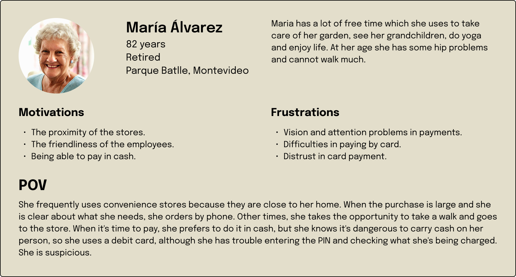
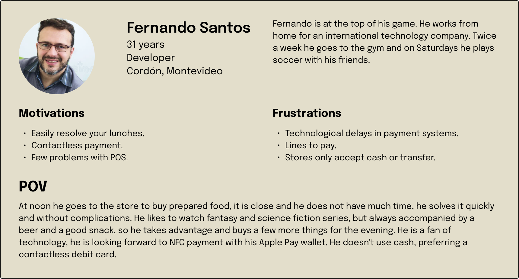
Key finding
- Interaction with people is being reduced by self-checkout and ATM payments.
- In Uruguay, cash payments are still valid.
- Payment flexibility and synchronization between physical and online stores.
- Users are looking for comfort, personalization and security.
- Accessible payment systems.
- The rise of AI.
Conclusion
Current payment methods do not take advantage of available technology to enhance the user experience. Lack of personalization, accessibility and emotional connection to the brand can affect customer loyalty.
Solution
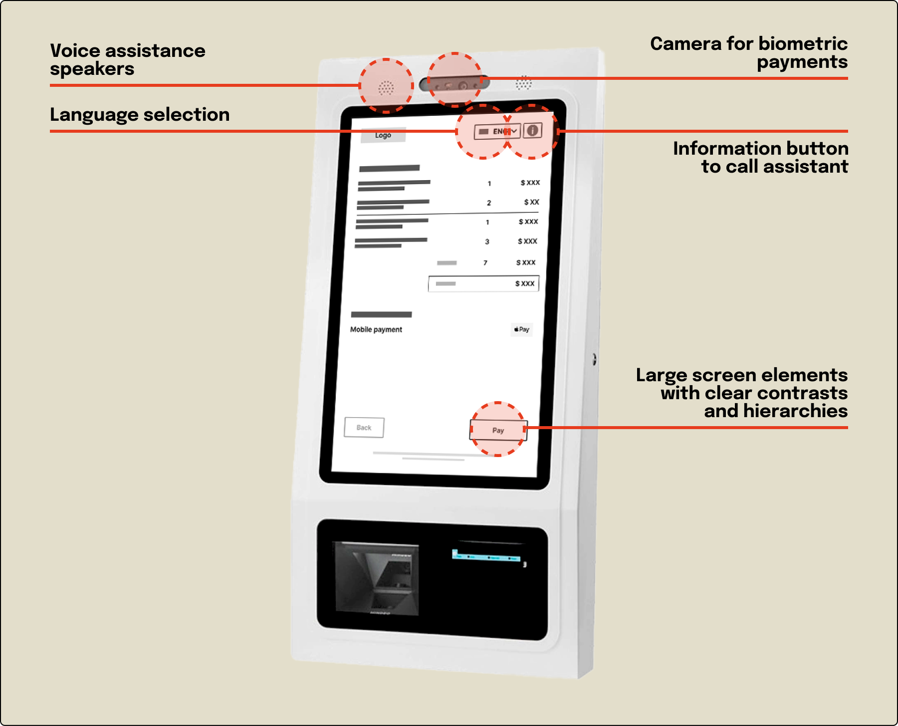
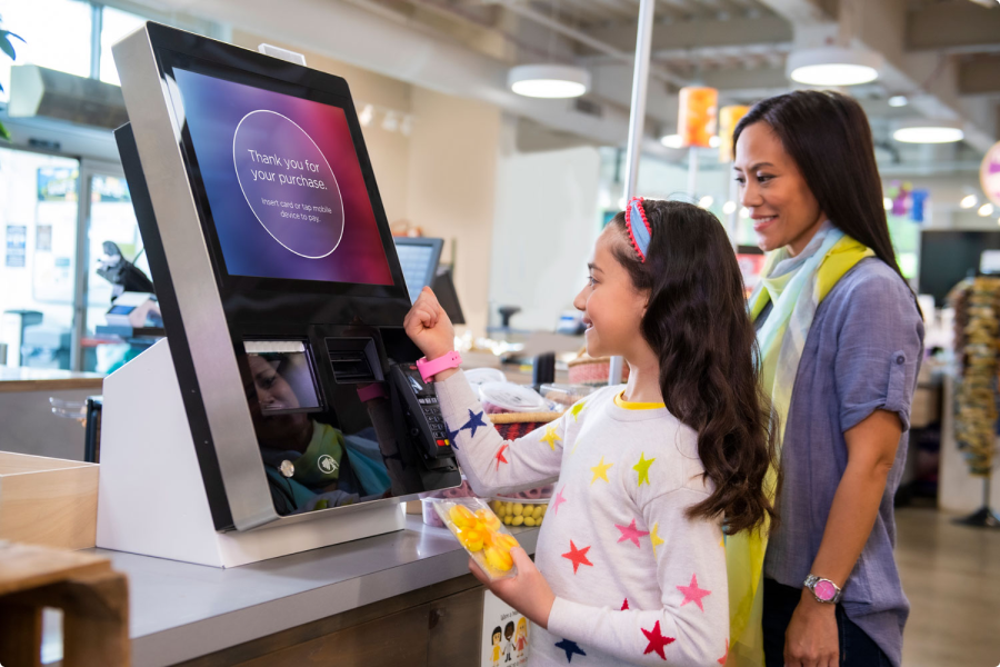
The solution proposed, taking into account all the information collected, the analyzes carried out and the conclusions drawn, is to use the self-checkout process. This system is new in Uruguay and has the characteristics to solve the needs raised. For this system, the use of large screens is proposed to improve the purchasing experience and personnel who can assist in the process, understanding the different users and innovation in the process.
Direction
Vision statement
Transform the in-store payments process into a more efficient, personalized, accessible and approachable experience.
Short term solutions
Implementation of improved contactless payments
- Mobile payments with NFC.
- Speed up and secure the payment process.
Payment interface customization
- Develop more personalized payment interfaces.
- Expand payment methods (credit cards, debit with PIN or NFC and mobile with NFC).
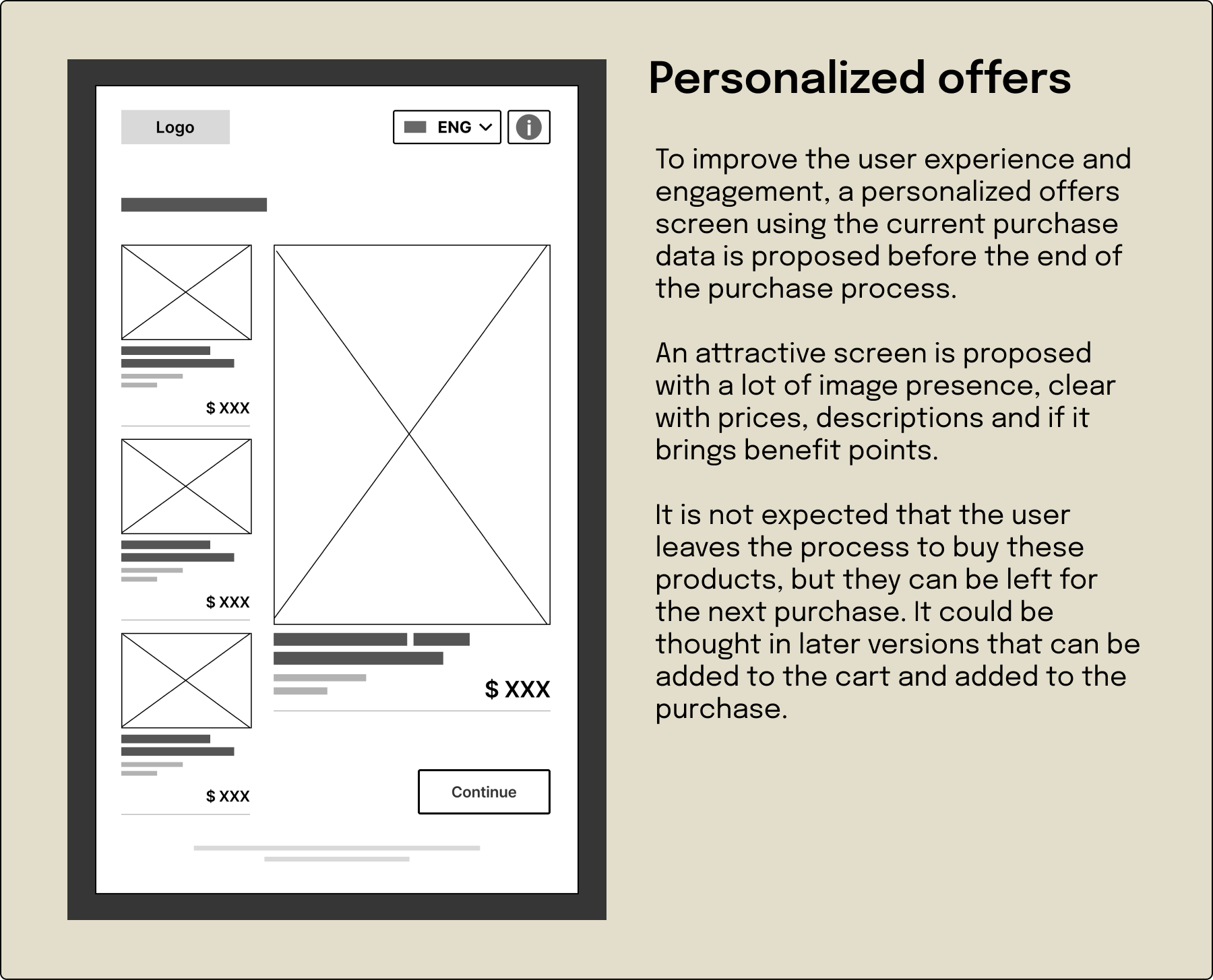
- Exclusive offers related to the purchase.
Long term solutions
Integration of biometric payments, gift cards and membership points
- Implementation of biometric payments (facial recognition or fingerprint authentication).
- Payment methods with gift cards and membership points.
Implementation of accessible payment processes
- Incorporation of voice response mechanisms and on-screen assistance.
Integrated loyalty and rewards platform
- Loyalty programs (membership points).
- Personalized rewards.
Scenarios
The short and long term solutions pose new scenarios in relation to the current one.
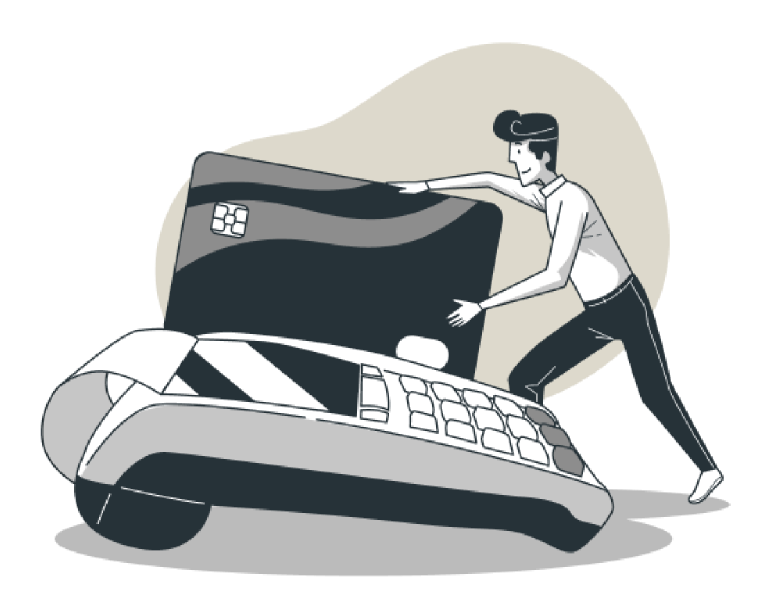
Current scenario
A user visits a store and makes a purchase using a debit card. The transaction is efficient but lacks personalized elements.
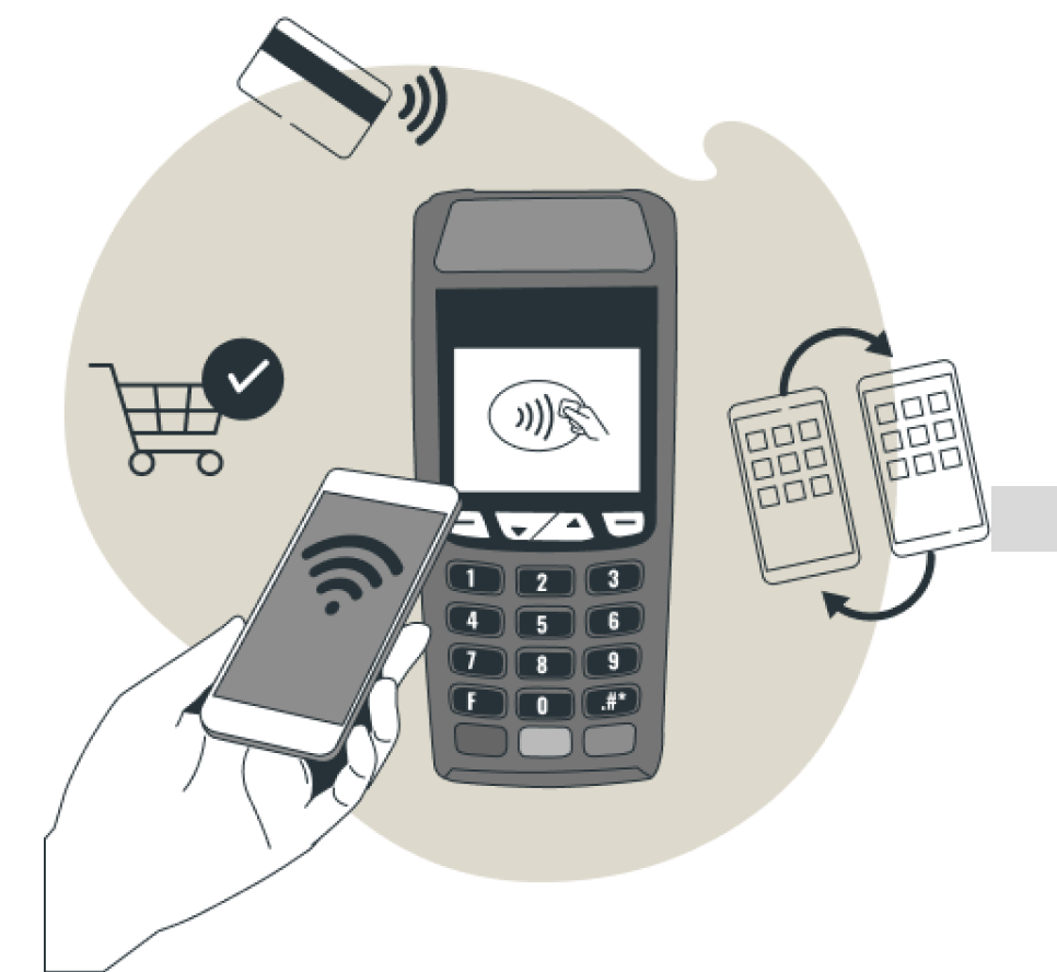
New short-term scenario
The same user uses her mobile device to make a contactless payment, receives personalized offers.
New long-term scenario
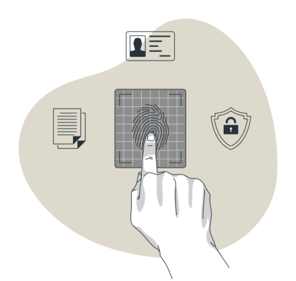
A user makes a biometric payment using facial recognition. At the same time, he benefits from a personalized loyalty program that offers him discounts tailored to his preferences and shopping needs.
Design
Case of use
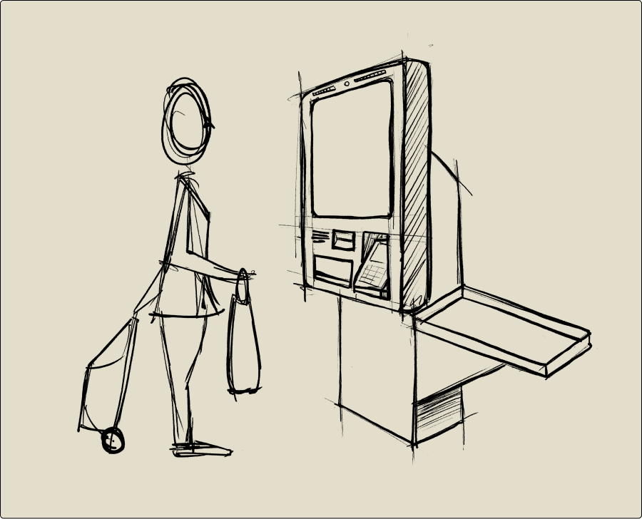
A use case of a self-checkout system for the MVP is proposed. In this process the user, the customer, scans his products and performs the purchase and payment process. It is necessary to have an employee to provide assistance, either for errors or to help in the process.
User flow MVP
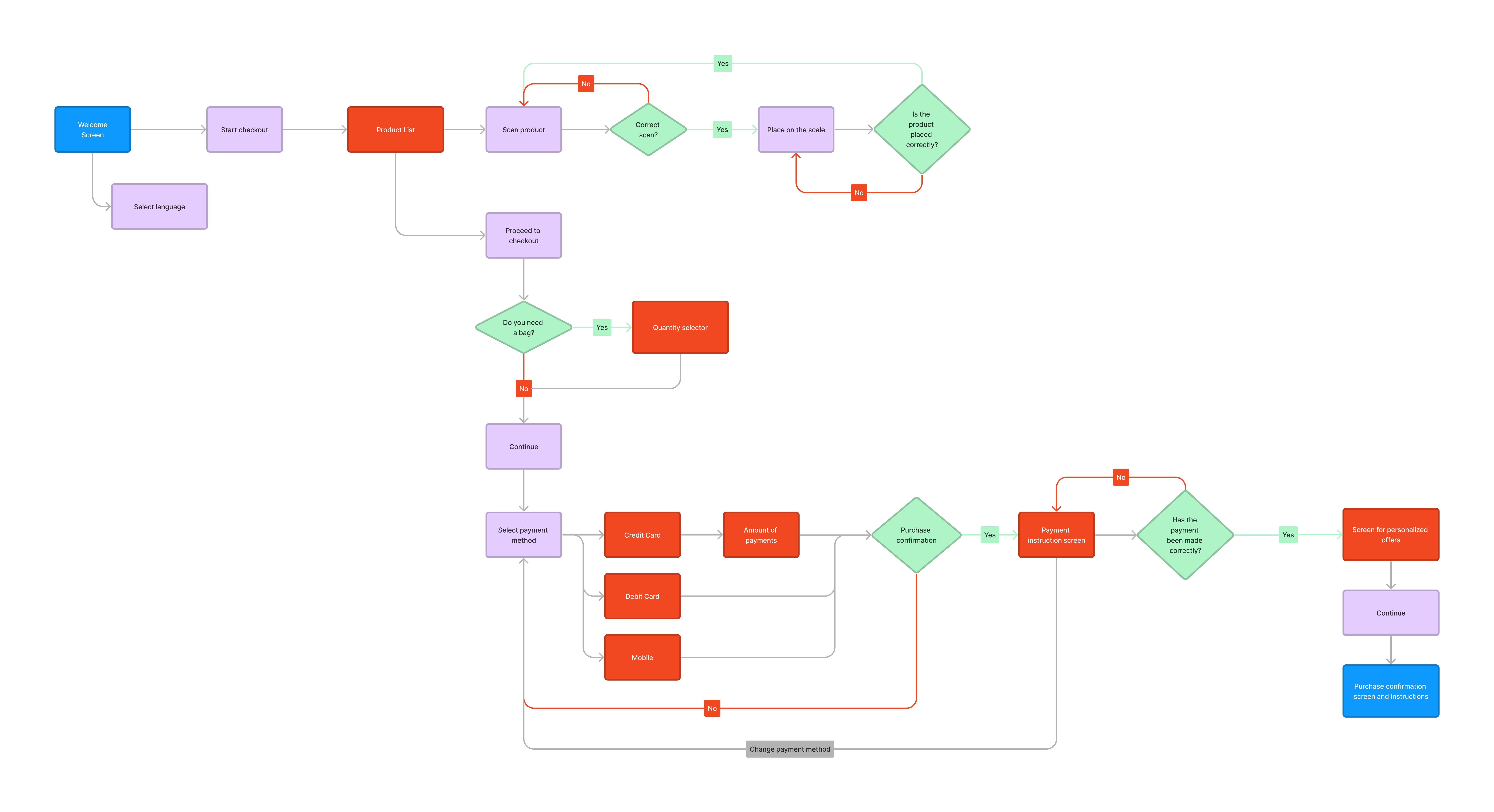
For the proposed MVP, the following user flow is developed that allows us to understand the purchasing process, the steps and the possibility of making adjustments if necessary.
Moodboards
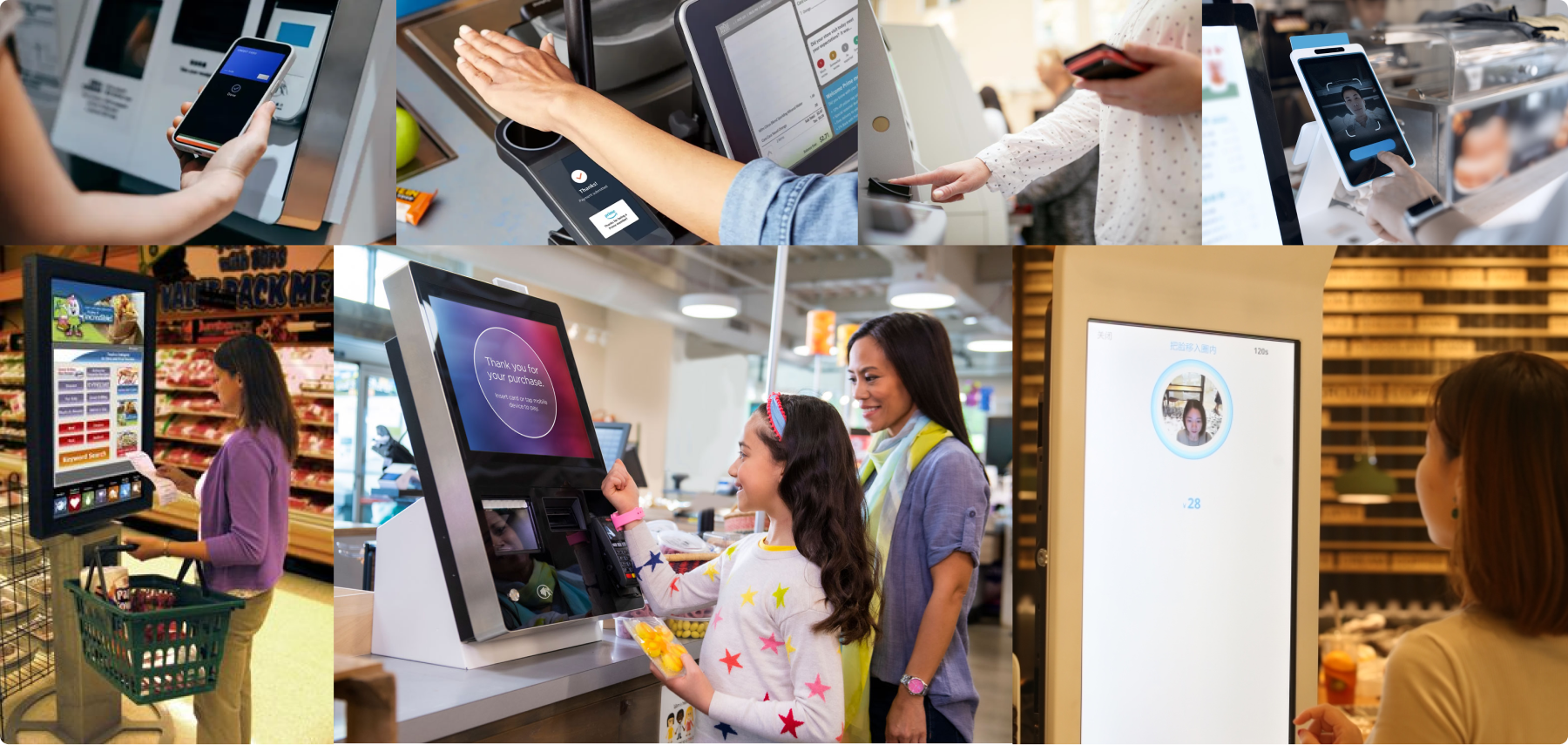
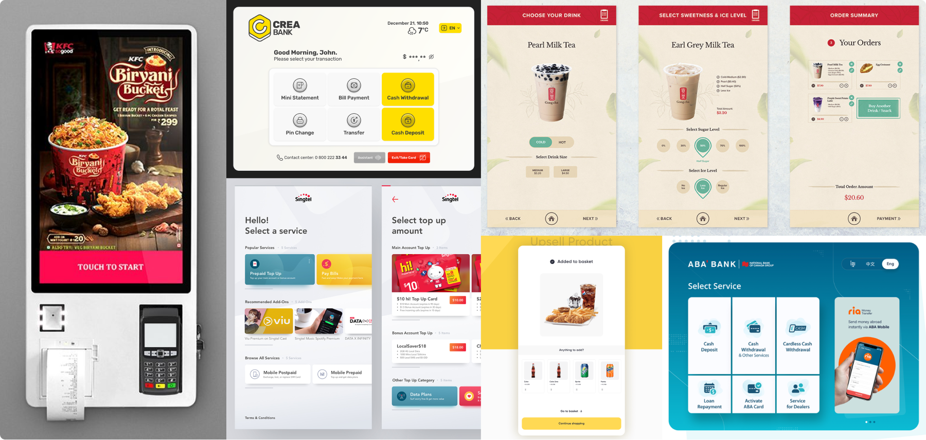
When proposing the design guidelines we made two moodboards. One with the interaction experience and another with interface references. This allows us to understand ergonomic issues, proportions and sizes.
Low and medium fidelity design
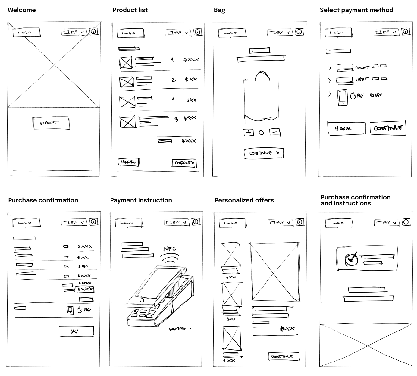
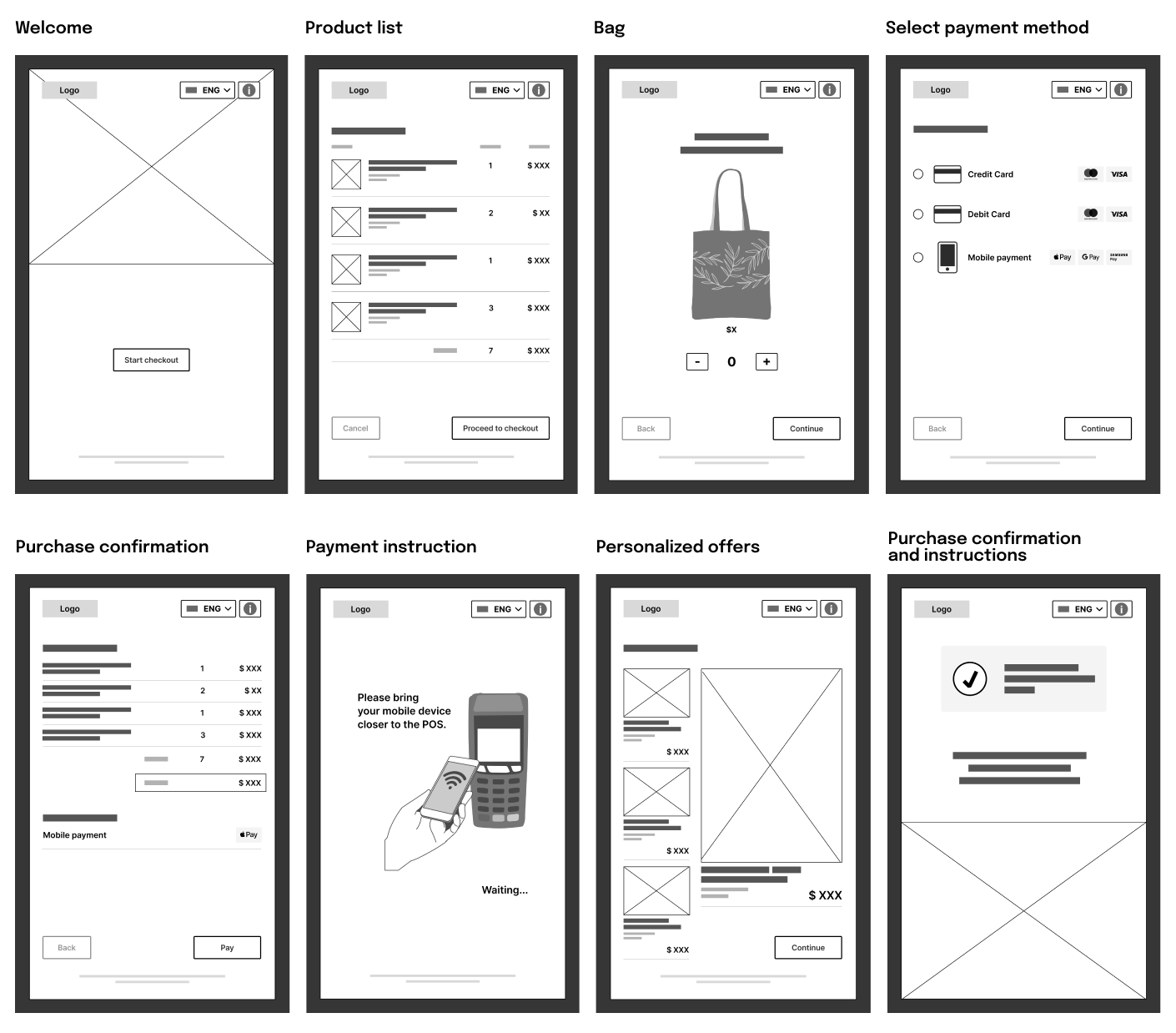
With the ideas raised, system references and uses, hand sketches are proposed as low-fidelity wireframes to then design the medium-fidelity wireframes and validate the idea.
Planning
Next steps and efforts
Coordination and development of solutions
Coordination with the design and development teams to validate the proposals and make the necessary adjustments. MVP development.
User testing and implementation
Test the MVP to gather user feedback and make any necessary adjustments. Implementation.
Development of integrated platforms
Development of technological platforms for the implementation of biometric payments, accessibility and loyalty programs.
Collaboration with technology providers
Establish partnerships with technology providers to ensure successful implementation of innovative payment solutions.
User testing and implementation
Integrated platform testing to gather user feedback and make necessary adjustments. Go to live.
Marketing campaigns
Plan marketing campaigns to communicate improvements to users, highlighting the benefits of a faster, more secure, personalized and accessible payment experience.
Analysis and monitoring
Analysis and monitoring of solutions throughout the process. Collect usage data, analyze improvements, look for errors, and make adjustments as necessary.
Results
This project brings new challenges. As a designer of digital products, interaction with hardware or devices is limited to mobile devices. In this case, the study of the interaction with the space, the machine, the large screen, the POS and the store circulations is of great importance in decision making.
Something that should be considered in a larger scale project and in conjunction with the client is the accessibility of both the system and the store.
This experience enriched me in leaving the screen and understanding the experience from a more general perspective and in different layers, beyond the system.