Product Designer
UXUI
Case Study
Overview
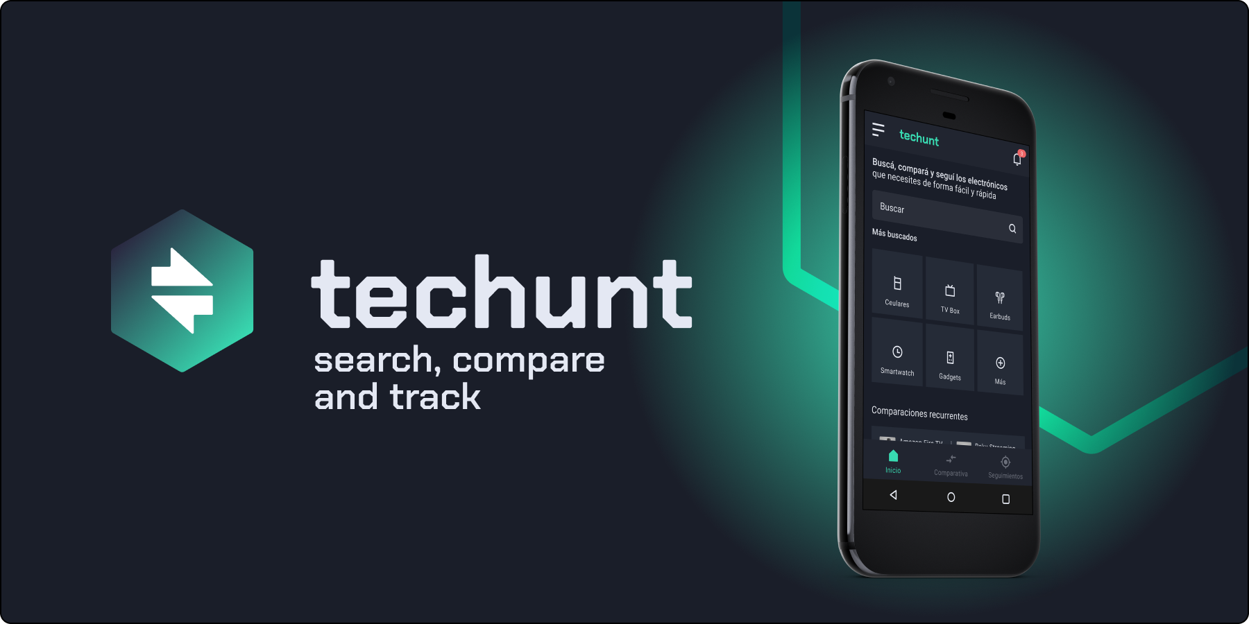
techunt is a mobile app for searching, comparing and tracking electronic products. It searches different online stores, compares them with similar products and brands in order to track the price to buy the product at the right time.
For this project we did the complete UXUI process, from research, user testing, flows, wireframes, design and prototyping.
Type
Identity
Product Designer
My roles
Brand Designer
Design Strategist
Product Designer
Platform
Mobile App
Task
Conceptualization
Benchmarking
UX Research (User Persona, Cardsorting, Userflow, Usability Testing and Heuristic Analysis)
Wireframes
UI Design (Design System, high/medium/low design and Prototyping)
Brand Design
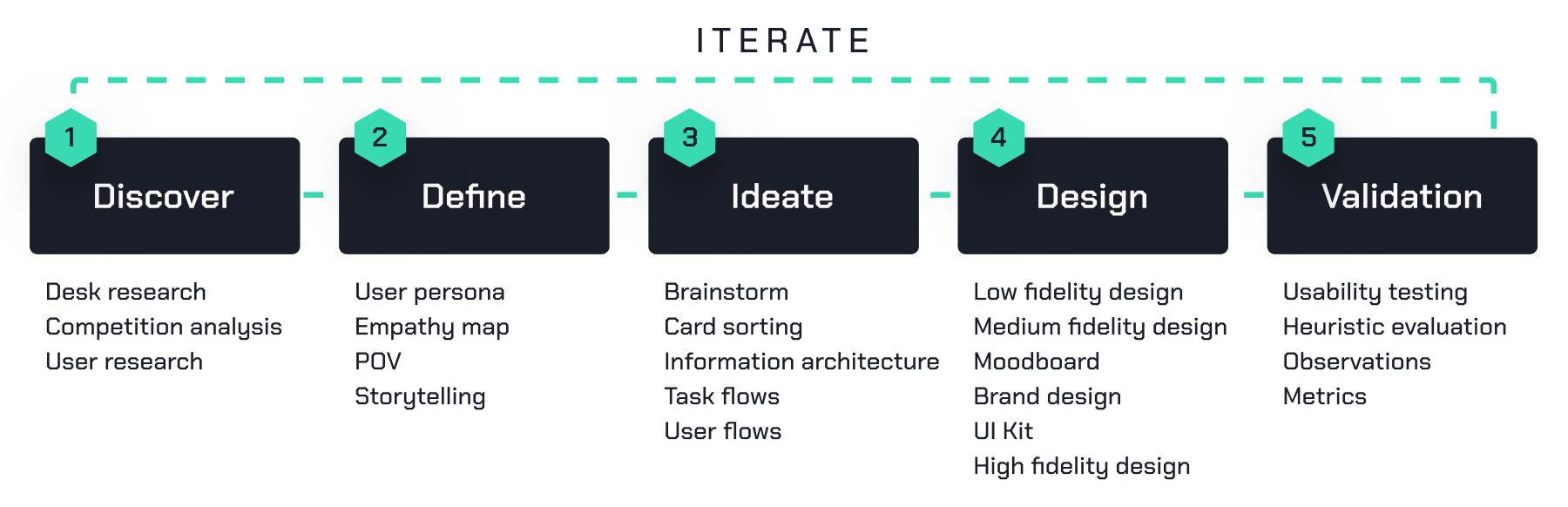
Design process
For this project, the Design Thinking and Agile UX frameworks are taken as a basis for the design process, understanding that iterations are developed interspersed between stages.
Understanding the problem
Problem
Thanks to the possibility of making remote purchases, people in Latin America can access any type of electronic products from different parts of the world. However, due to the high number of offers, selecting the right product for your needs is really difficult and takes a lot of time.
Objective
Simplify and speed up the search and purchase decisions for electronic products in different online stores abroad.
Solution
Centralize the search, comparison and tracking of electronic products from different online stores quickly and easily, both for experienced users and beginners.
Discover
Desk Research
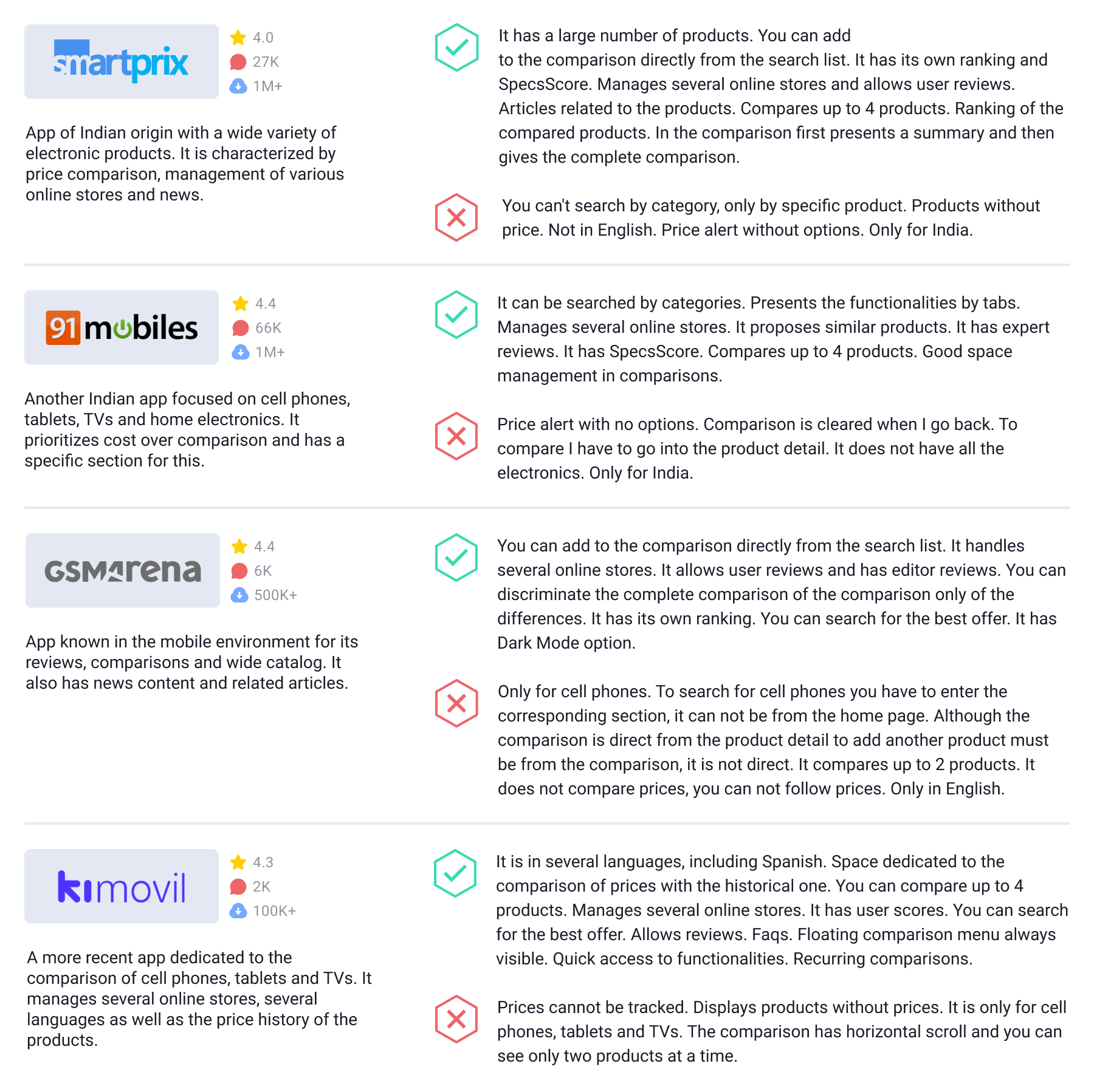
Competitor analysis
In the first instance, desk research was carried out, based on apps that we already knew, some that we consulted and finally searching through the internet and the different application stores.
In this search, no applications were found that meet the same objectives, we did find some that do so partially.
Data about the phenomenon
In order to validate our hypothesis, a search of press releases and search data on this phenomenon was carried out.
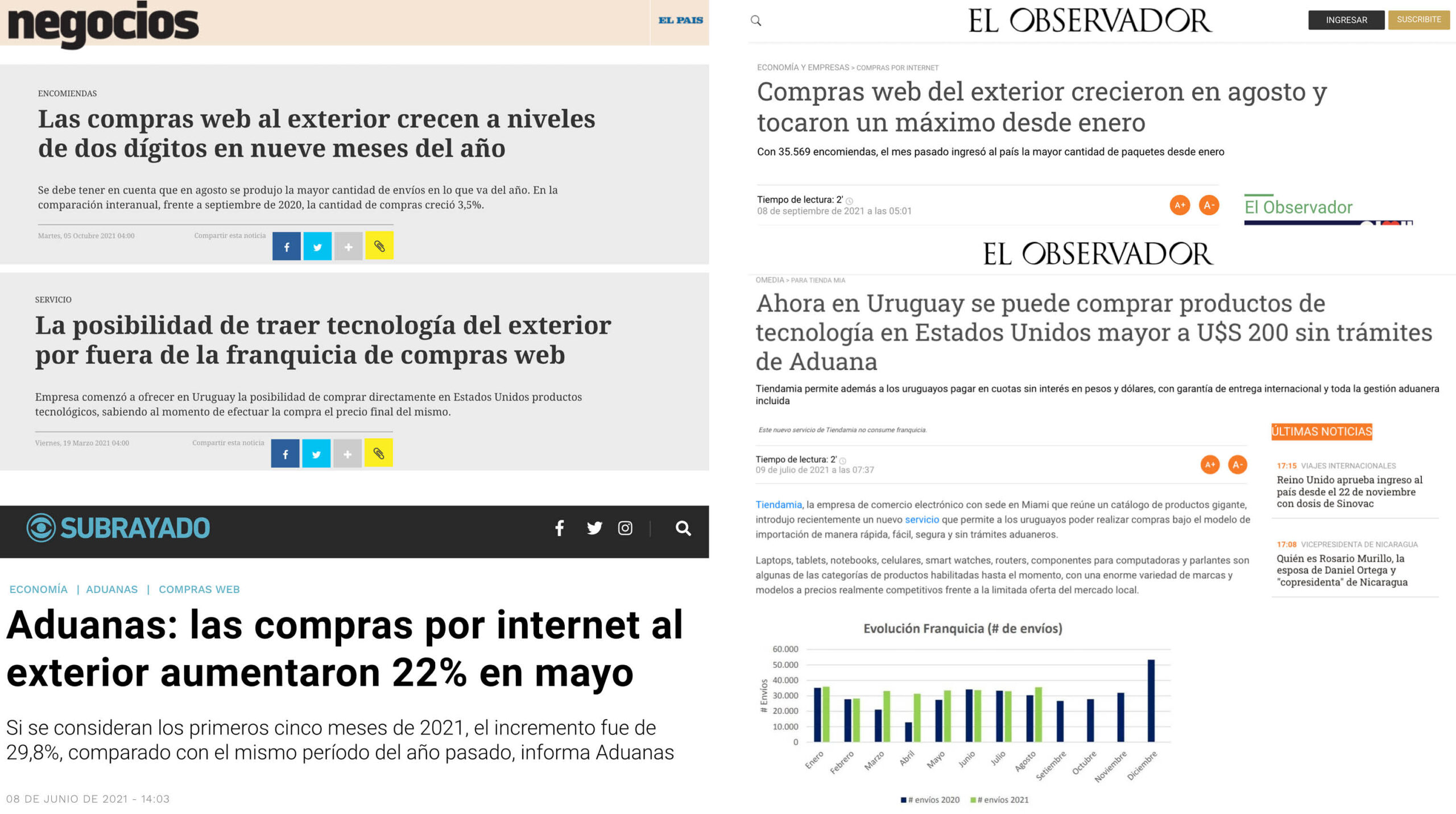
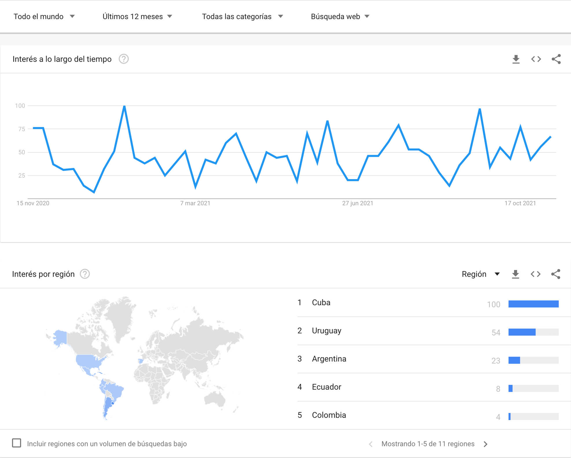
Conclusions
Foreign purchases through a courier are increasing, with franchise (purchases less than USD200) and now also without franchise. Added to this is the fact that the large number of product offers from online stores makes purchasing products not an easy task.
There are many search, comparison and price tracking applications but not with all these functionalities, neither for the region or in Spanish. According to the reviews of the apps analyzed, we observed problems with searches, interfaces and transparency in comparisons. On the other hand, the correct and updated price monitoring as well as the information design is valued.
Survey
Based on a public analysis, an interview was prepared with different questions that were asked of 6 potential users in an age range of 29 to 67 years, women and men with varying levels of experience. The questions sought to understand their relationship with technology, level of experience, situations and purchasing processes for electronic products through couriers.
Conclusions
- Product searches are carried out directly in the online store or in the courier if you have the option.
- There is no single system used to compare products. Generally, you access specialized YouTube sites or channels.
- The importance of price in the purchasing decision has to do with the person’s degree of experience. However, people who commented that this aspect is relevant rarely follow up on the products.
- It is observed that the level of satisfaction of the purchasing experience has no relationship with the level of experience. Some enjoy it and others feel that it wastes their time or finds it cumbersome.
- The majority made comments that they do not find everything in the same place, whether prices, comments or features.
- At high experience levels, comments were given on the veracity of the information and its quality. This makes the investigation more complex since information is also compared.
Define
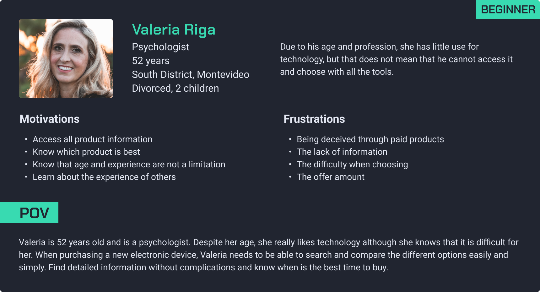
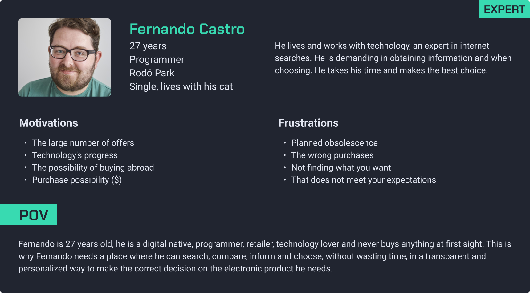
User persona
People who can buy electronic products from abroad are those over 18 years of age who have an international credit card, according to the decree. This is why the audiences are broad, therefore, for the app we are going to consider the level of experience when searching for this type of product. This is how we will create user personas, one for beginners and another for experts.
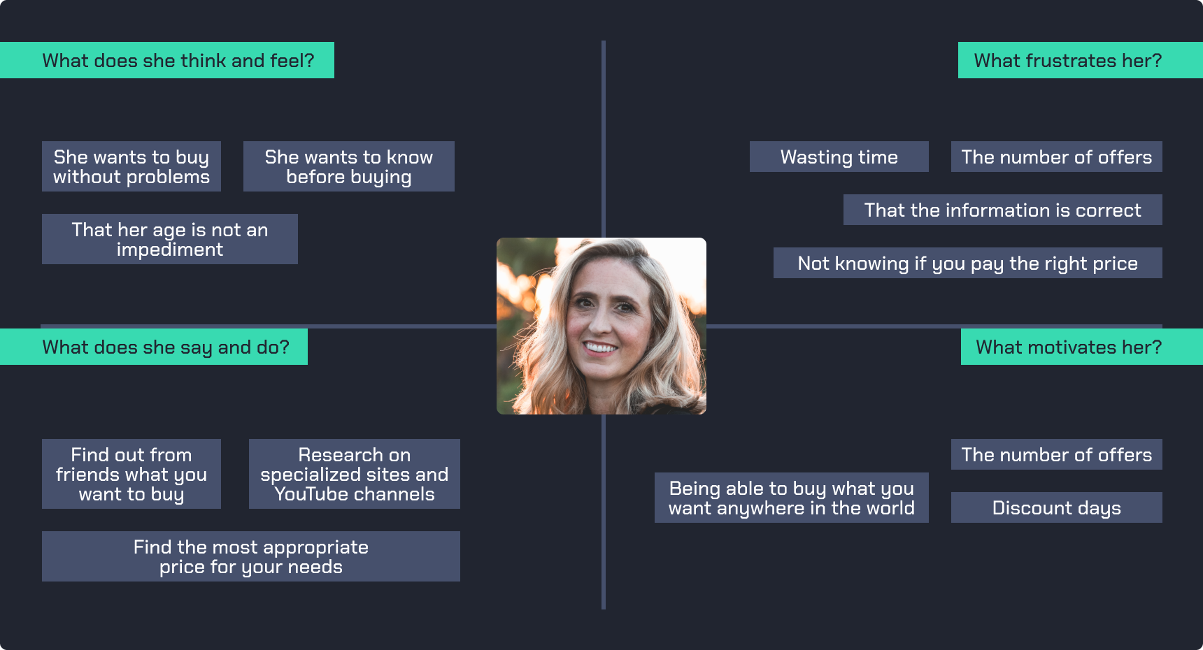
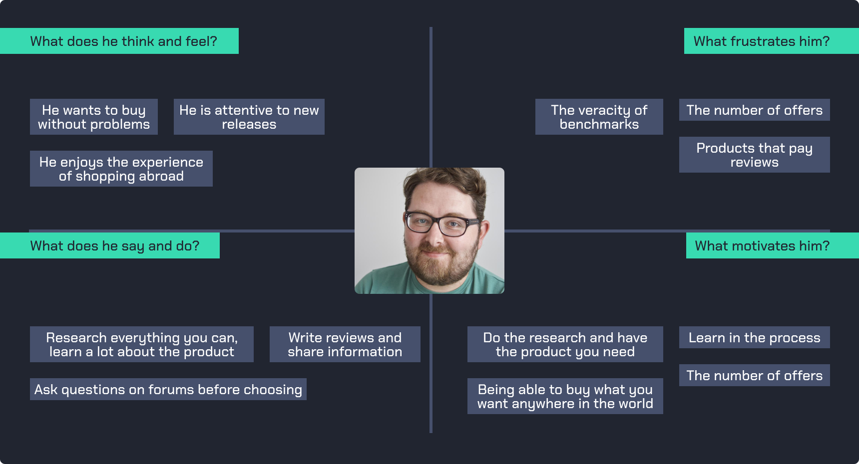
Empathy maps
After creating user personas to understand our users, we will move towards building empathy maps. These maps will offer a visual representation of users’ emotions, thoughts and experiences, complementing the demographic and behavioral information provided by people.
Storytelling

Valeria, every Sunday at 4 p.m. sits in her armchair to read with tea. Read some fiction, the occasional academic book, or whatever you can use. Paper books are her passion, her smell, turning the pages, marking them, scratching them. Already without new material and in a pandemic, she wants more. She knows that the internet is her next goal, but she is also aware that it is difficult for her. Her iPad has been her faithful friend, but she doesn’t get that feeling that paper gives her. So she talks to her friends about the situation and they tell her about the ereaders. There she begins her research, she takes advantage of her free moments to learn about these devices, liquid ink, epubs, mobi, the Kindle, the nook, a new world. This is what she wants, but she still doesn’t know which one, there is a lot of offer, many prices, many specifications. Luckily, Valeria has techunt for her research. She looks for the models that she saw in a review on YouTube, but she can’t find them all, no problem, she doesn’t want to complicate things. She finds a pair, compares them, reads reviews, analyzes prices. She doesn’t want to spend a lot, she still feels it’s too much for her. Finally, she finds the piece of information that said it all: the battery. Valeria doesn’t like charging around all the time and the Kindle PaperWhite gives her weeks of battery life. Looking at the price history, she sees that at the end of November there is a BlackFriday and she sets the alert for it.
Sunday, December 12, 4 p.m. Valeria savors her tea and reads Daniel Kahneman’s latest book on her ereader.
Ideate
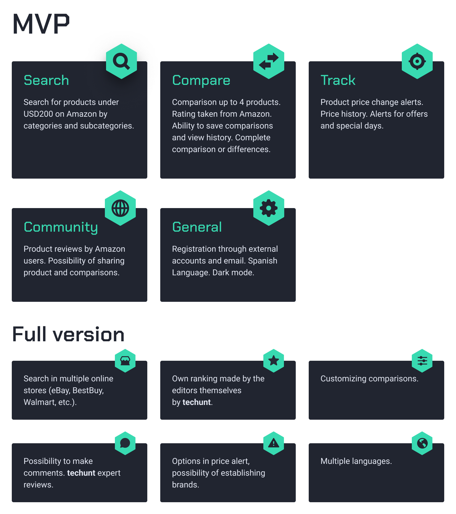
MVP and full version
From the previous stages, all the functionalities of the application are listed and the MVP and a full version are established thinking about a scalable app.
Card Sorting
To assemble the content, two Cardsorting were carried out, they were analyzed, conclusions were drawn that will be an input for the assembly of the information architecture.
From the first Cardsorting the following comments emerge:
- People associate the card keyword with the category without analyzing the function in relation to all categories.
- Because of how the cards were arranged, it is understood that the “Compare” categories are confused with “My comparisons”.
- So it is resolved, merge them.
- Due to the above, perhaps many of the labels are long and make quick understanding more complex. They will be simplified.
- Finally, it was decided to add some product categories to give context to the study and improve the response.
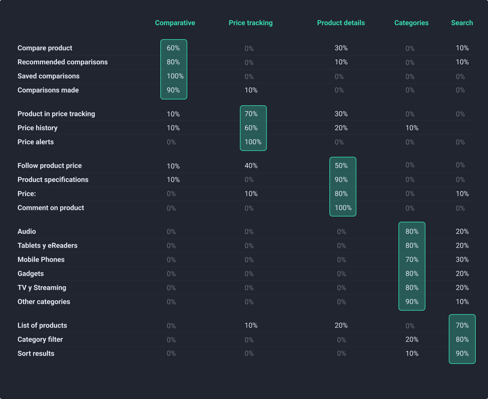
Cardsorting Results #2
Conclusions
From the studies carried out, we conclude that the analysis of the first Cardsorting and subsequent adjustments in the labels and categories were correct.
The merging of the comparison sections clarified the understanding of the contents and functions. On the other hand, the simplification of the labels meant that there was more agreement on the order of the cards among the participants.
Finally, in the second study you see the union of the search and categories, so it is correct.
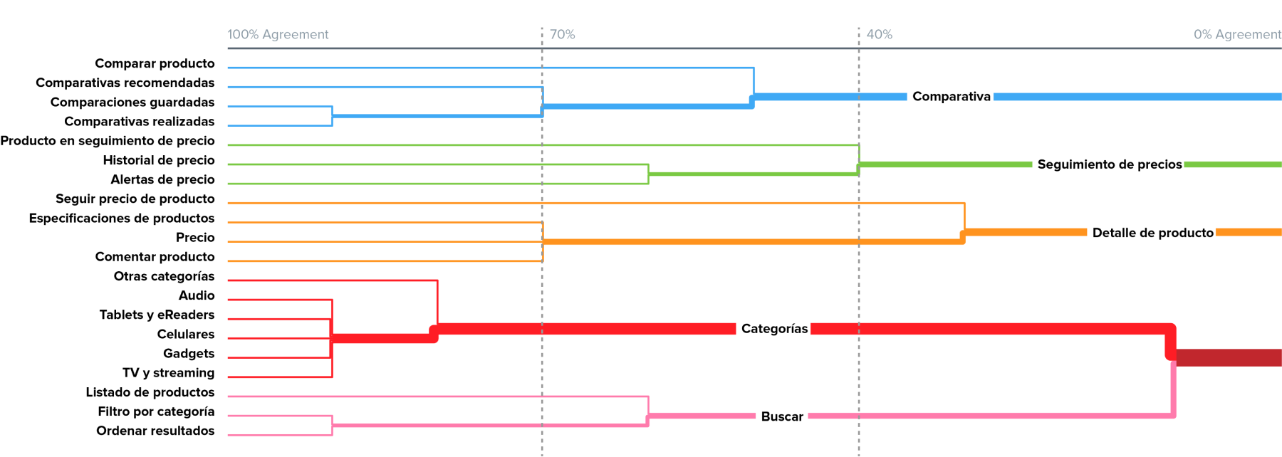
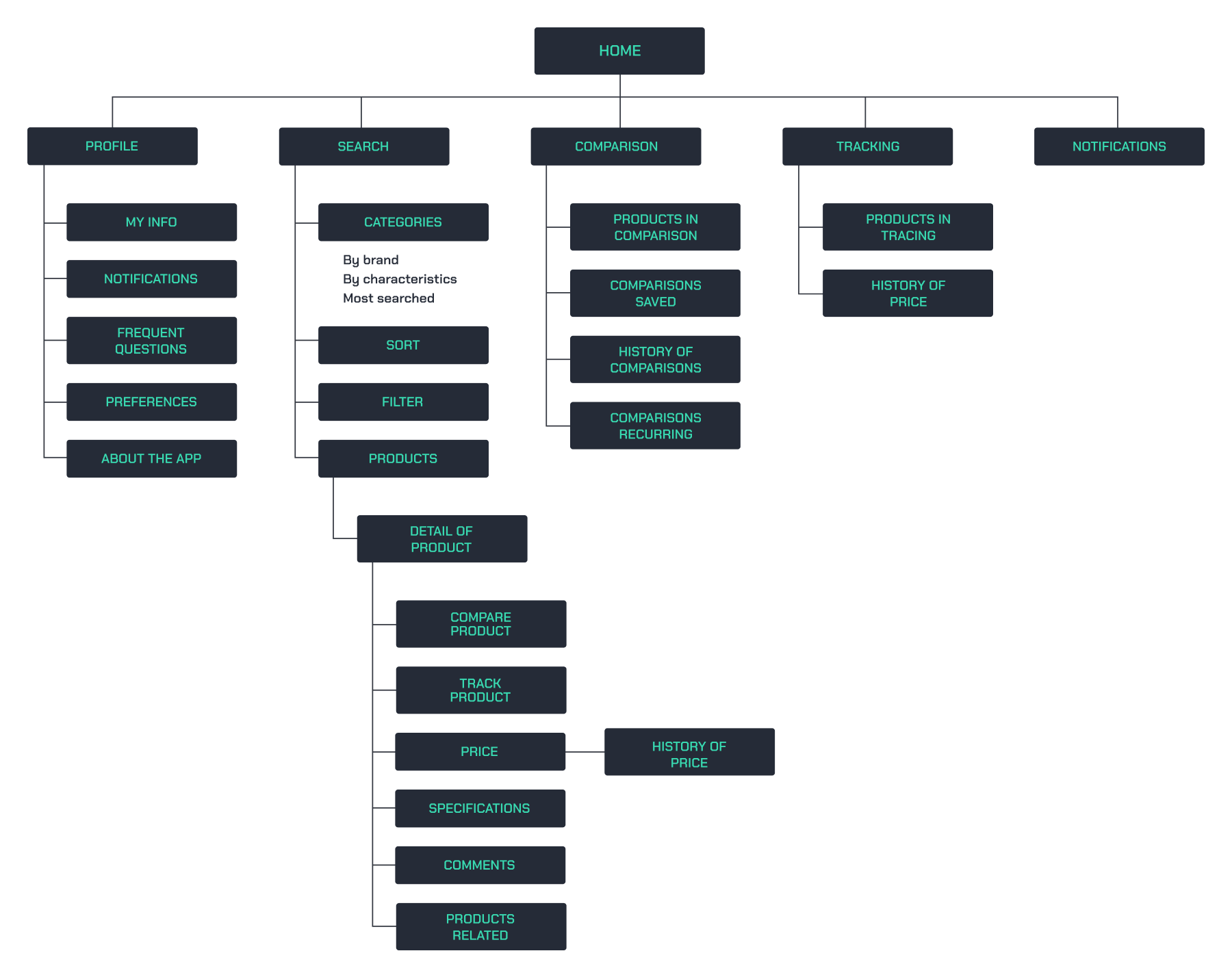
Information architecture
Based on the studies, analysis and conclusions, the organization chart of the app’s information architecture was created.
Task flows
For this development, three Taskflows were carried out for the different functions of the app and from this a Userflow was carried out based on the Flowchart.
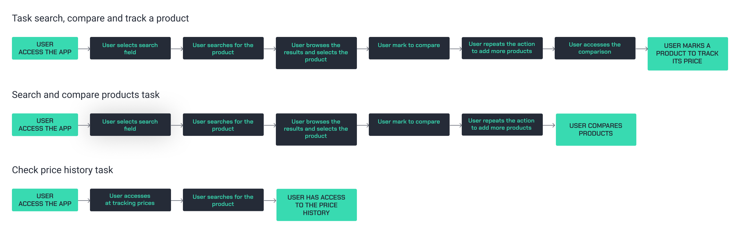
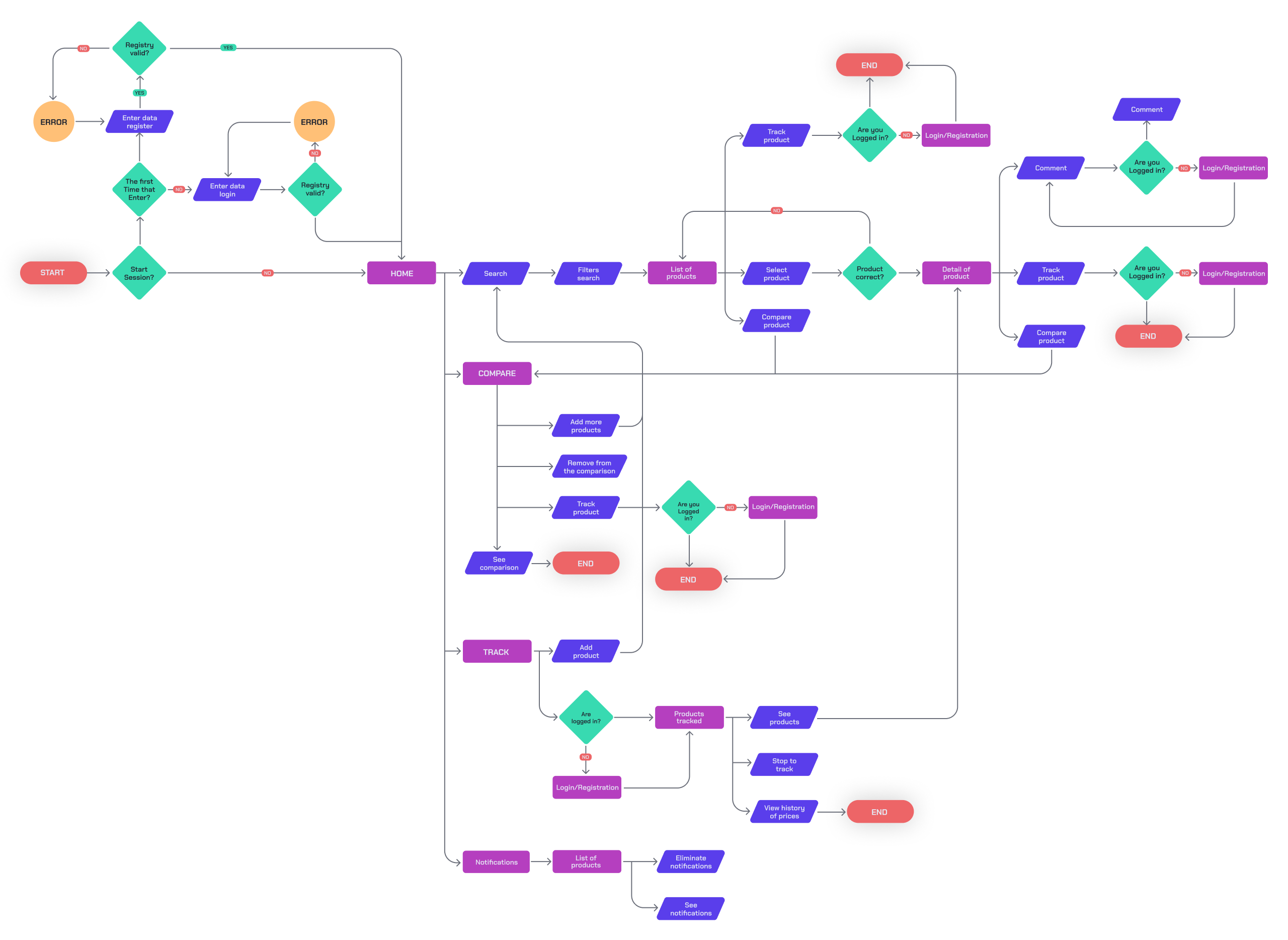
User flows
Having developed three Task flows, a complete Userflow and four paths are created for the most important functions of the app’s MVP.
This app has the peculiarity of being able to search and compare without having to be logged in. The option to register or log in is given at the beginning but it is not mandatory. For actions that require saving, following and/or commenting if necessary and you can do so prior to each of these interactions.
Conclusions
The work with users was essential to finish affirming the proposed hypotheses and understand their frustrations, motivations and needs in the purchasing experience. The need to have all the functionality in one place is clear.
The study of cardsorting helped us improve the labeling and length of the sections of our application so that it was more intuitive and simple. It was also decided to unify sections and simplify the comparison process.
All of the above provided us with the basis for creating faster and simpler tasks that ended up being the pillars for the development of a broad but complete and simple userflow.
Design
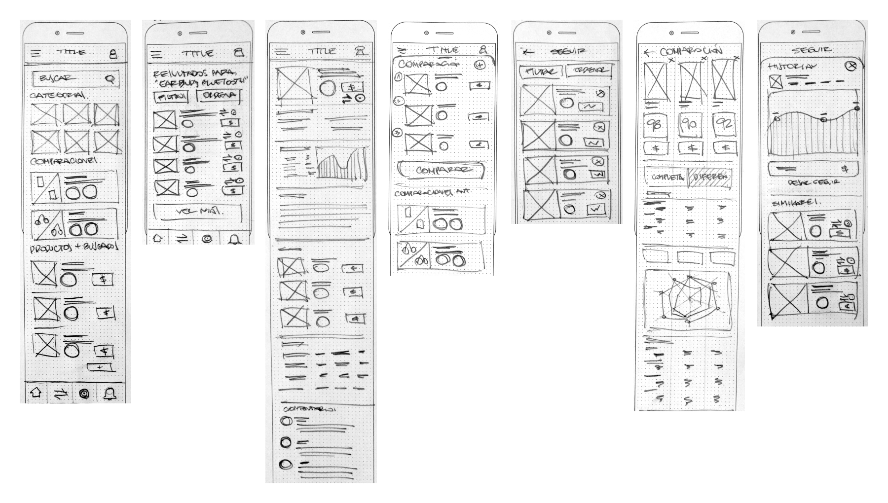
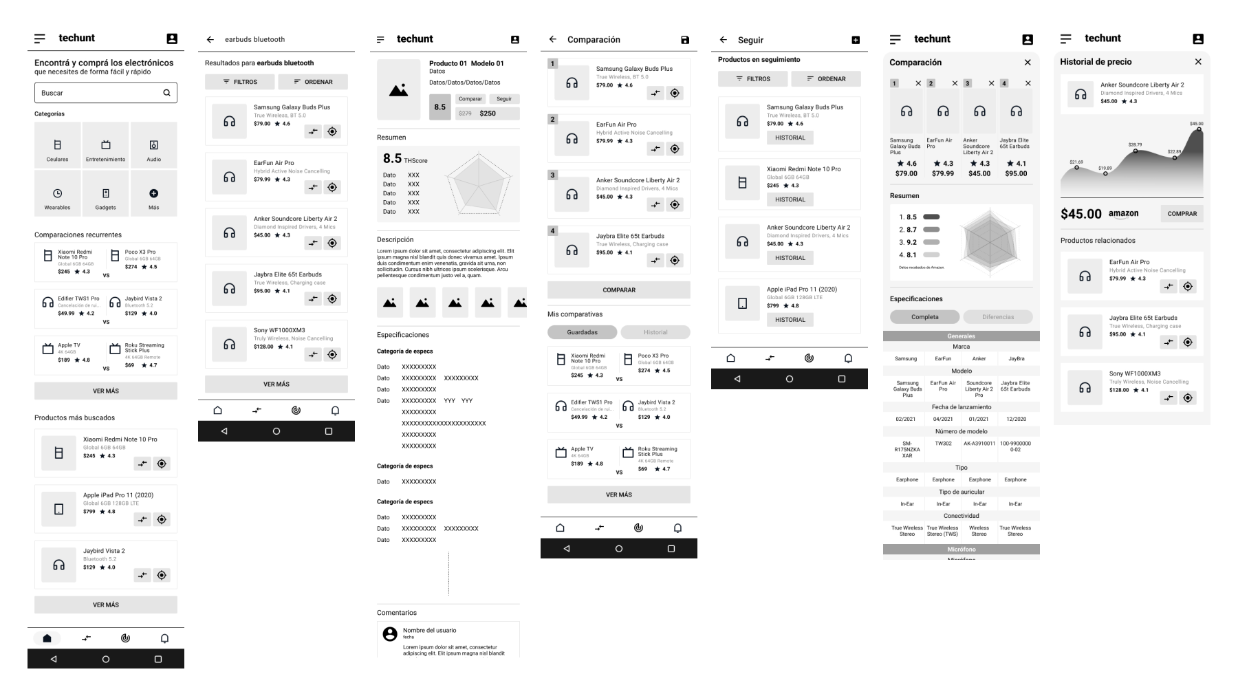
Low and Medium fidelity design
Wireframes were made in low fidelity, analyzed, improved and moved to medium fidelity to be able to validate with users in usability tests and heuristic analysis.
Validation
Usability test
For usability tests, 5 tests were conducted with users according to those proposed in the archetypes. We differentiate them between expert, regular and beginner users, as well as by the operating system they use on their mobile devices.
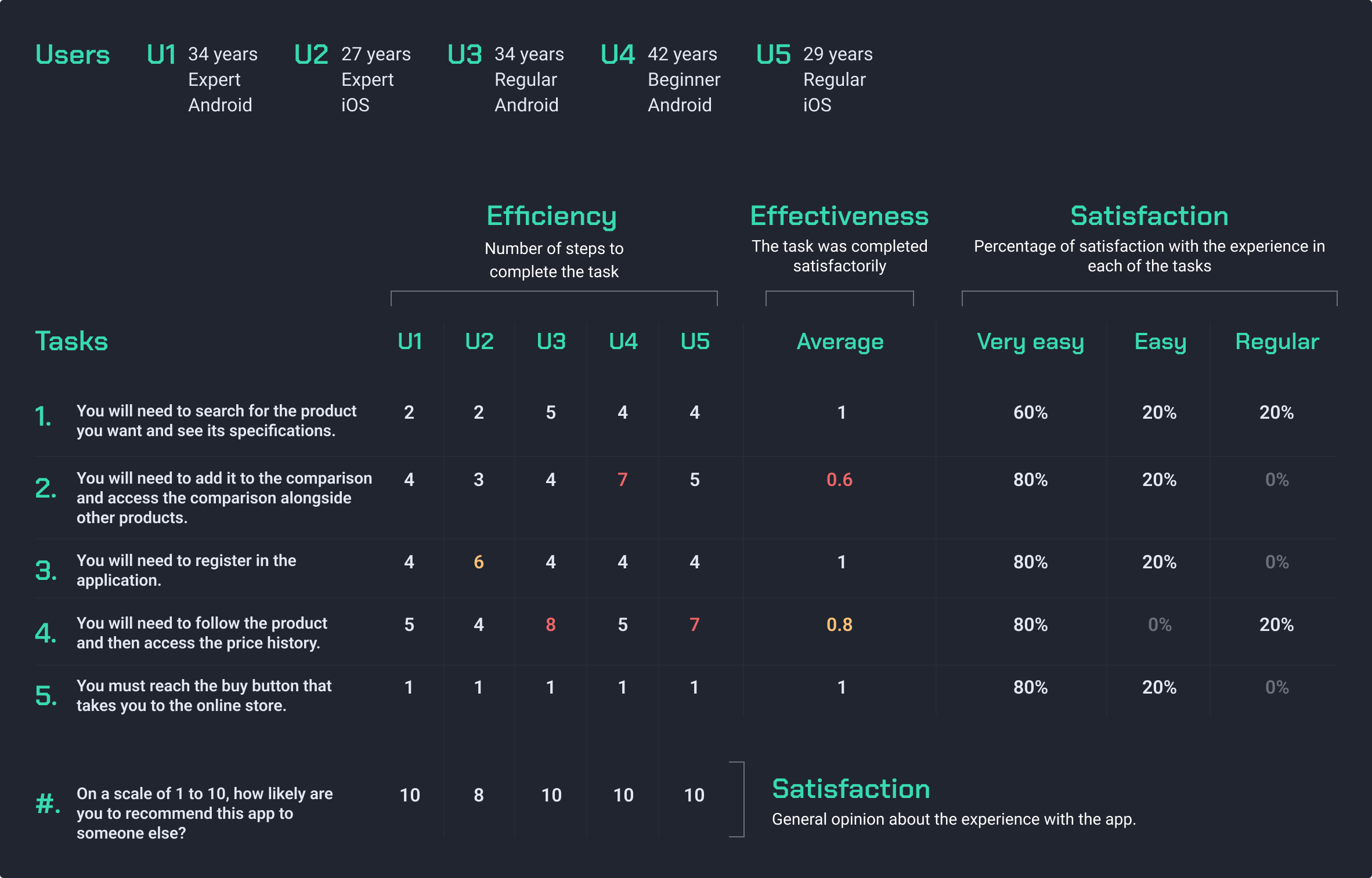
Conclusions
The tests went well and the results showed several changes to be made to the logic and interfaces of the app.
We observe that many of the mentioned problems respond to the low fidelity of the prototyping as well as the functionalities and the lack of contrasts in some of the elements that make the execution of the tasks possible.
On the other hand, it is noticeable in the use of the prototype that Android users compare to iOS users due to the navigability management. It also happens that expert users understand buttons and icons more quickly, but they are also more demanding with functionalities and interfaces.
Design
Moodboard
Brand
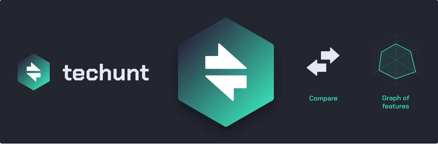
Understanding that most users will be adept at reading in English, either because of the products they consume or on review sites and online stores, it was decided that the name of the app would be in this language. In this way we are committed to quality and an international market. The name is a fusion between “technology” and “hunt”, understanding the latter in the functions of the application, search, compare and follow. Thus, taking advantage of the play on words, techunt emerges.
Identification sign
The arrows are worked to give the sensation of “round trip” between the products. The tips are rounded as is the typography. The hexagon is used as a base and referring to the graphics that you will find in the app.
As a second reading, the new composition of the arrows you can see a lightning bolt and can relate it to what technology and energy.
Typography
A san serif typography with geometric features is chosen. referencing the monospaced typeface used mainly in the computer code and this associated with the technology. Some adjustments are made to the tips so to “soften” the composition and be closer.
Color palette
The color palette is 100% technological. The dark mode grays and green to generate contrast and dynamism associated with digital and technology.
UI Kit
Having adjusted the medium fidelity designs and the graphic system, a UI Kit was created in parallel to create the high fidelity designs.
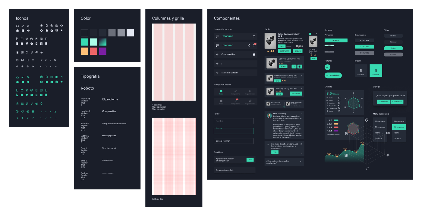
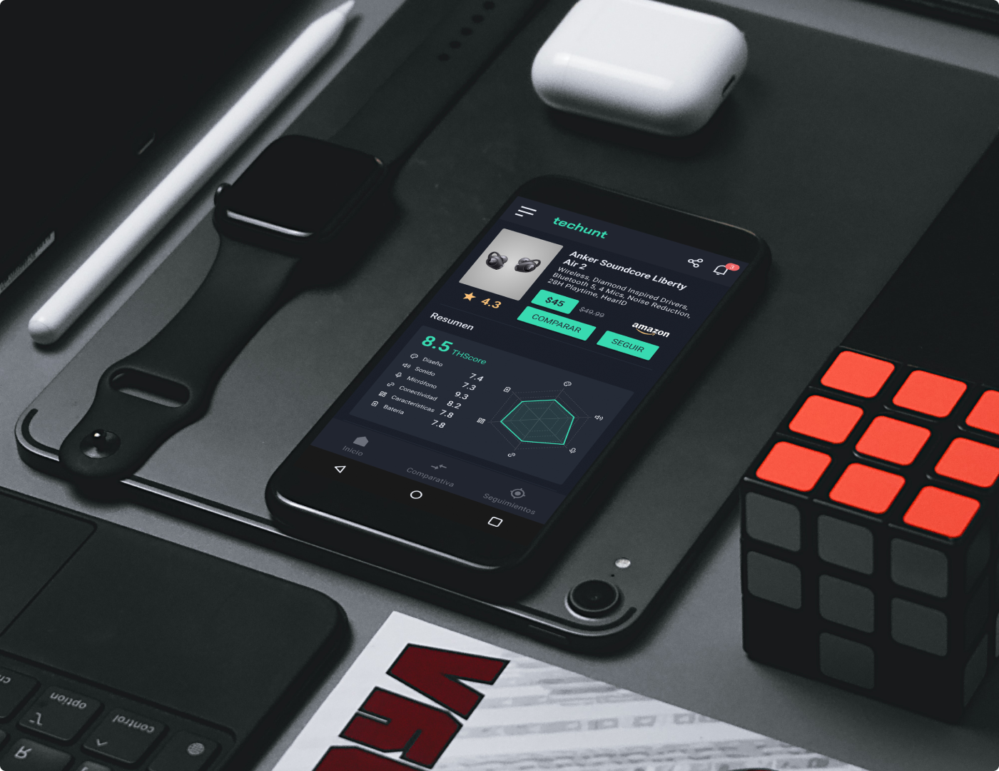
High fidelity design
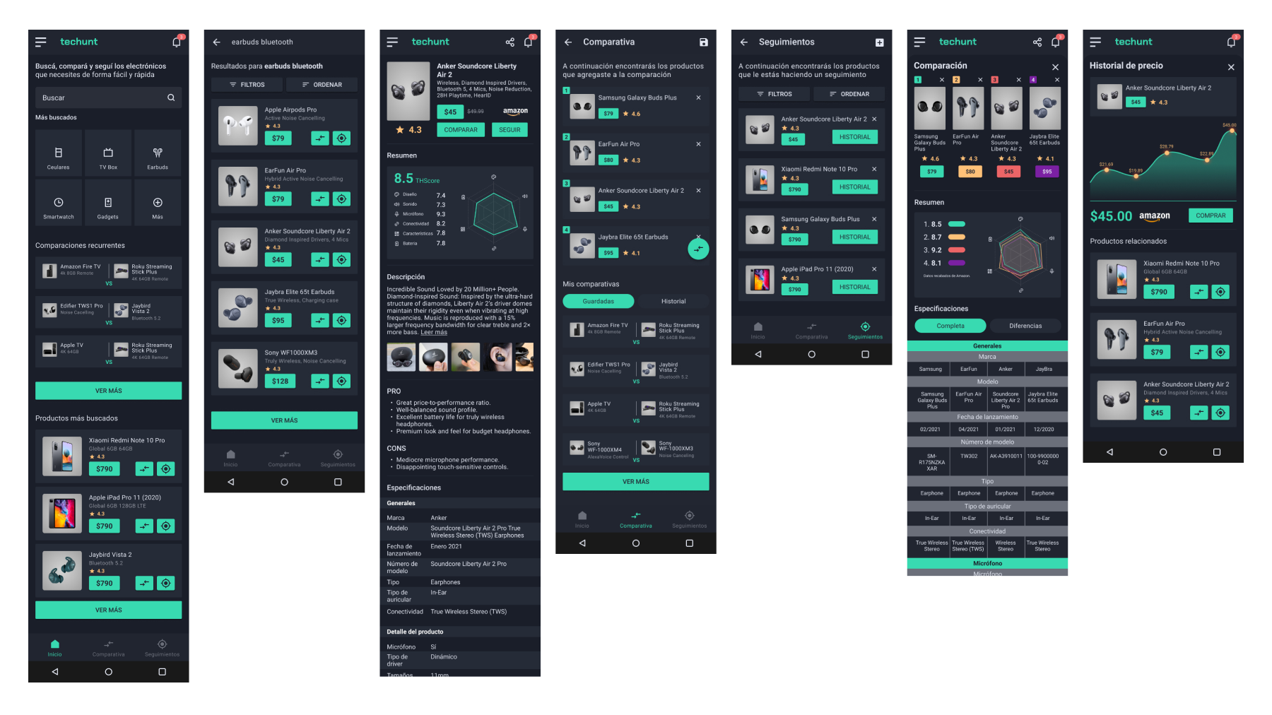
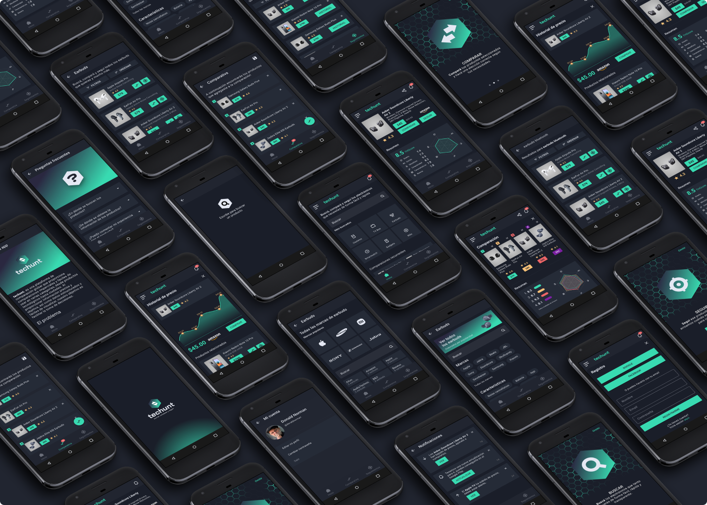
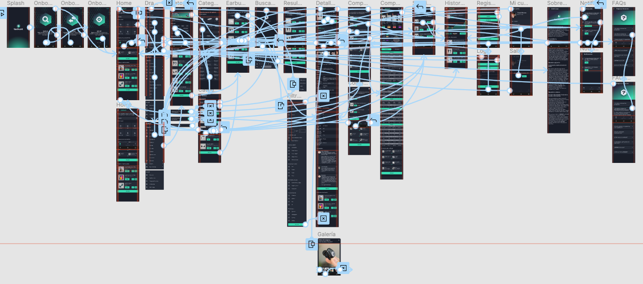
Prototype
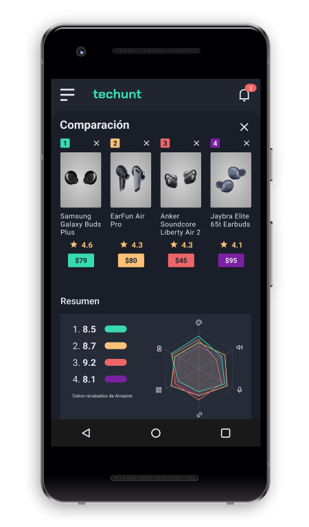
Finally, a functional prototype was made with all the screens.
Results
I was pleased pleased with the result, a complex but simple-to-use application with great scalability potential.
During the research process I found that Latin American users still do not have experience in this type of comparison and tracking applications, something more common in the USA or Europe. This may imply that the adoption of this proposal involves thinking about good communication strategies, prior to the launch and during its course. The most important thing is the generation of community that will make the application gain popularity and user support.
Personally it was a great challenge since I was able to apply most of the methodologies, tools and processes of a complete project. The development of the application has not yet been planned, so monitoring, iterations, adjustments, improvements and validations with users are pending.